Table of Contents
The Foundation: Warm Neutrals, Never Cold
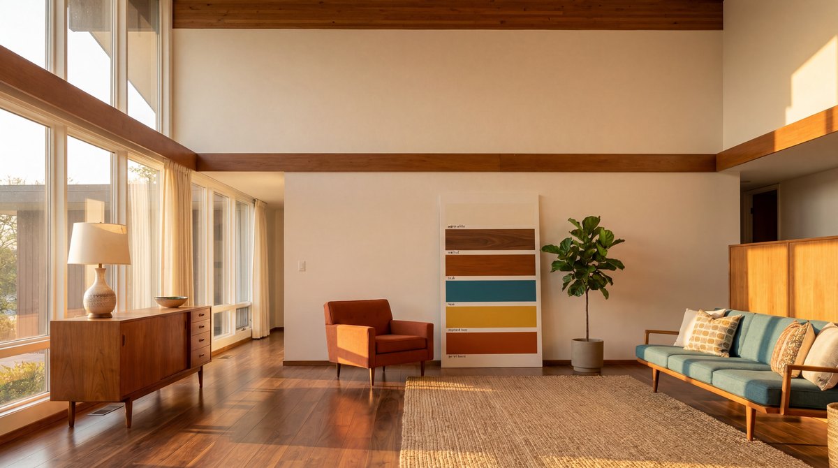
Every mid-century modern palette starts with warm neutrals, and the most important detail is the word warm. The number-one wall color is a warm white, around #FAF9F6, not pure #FFFFFF.[1] Pure white reads clinical and makes walnut look yellow next to it. The second foundation tone is a warm cream, around #F5ECD7, which works as an upholstery and textile base.
Then the wood does the rest of the foundation work. MCM wood tones are warm and light-to-medium, never dark stained, never painted.[2] Walnut sits around #7B4F2E, the core warm-wood reference. Teak brown comes in around #8B6355 as the secondary wood. The grain stays visible. If your foundation is warm white walls, warm cream textiles, and walnut-toned wood, you have the canvas. The accent goes on top.
It helps to think of the foundation as three temperatures of the same warmth. The walls are the lightest warm tone, the textiles are a step deeper, and the wood is the deepest. Because all three lean warm, the room reads cohesive even before any accent color appears. This is the part most generic MCM rooms get wrong, they reach for the accent first and treat the foundation as an afterthought, usually defaulting to cold builder-white walls. A correctly warm foundation can carry a room on its own. The accent is what people notice; the foundation is what stops the room reading like a rental.
The Big Three Accents (Choose One)
Mid-century modern uses one bold accent color, done genuinely boldly, against the warm-neutral foundation.[3] There are three classic options.
Teal, #2D7D7D. The most popular and the most overused. Still correct, but it carries the most risk of looking dated because so many starter-pack rooms used it.
Mustard yellow, #C9A84C. The second most popular, and arguably the safer pick. Mustard warms the entire palette and almost never reads dated.
Burnt orange, #CC6B2C. The underused gem. It pairs perfectly with walnut and warm wood, and because fewer people reach for it, it looks intentional rather than templated.
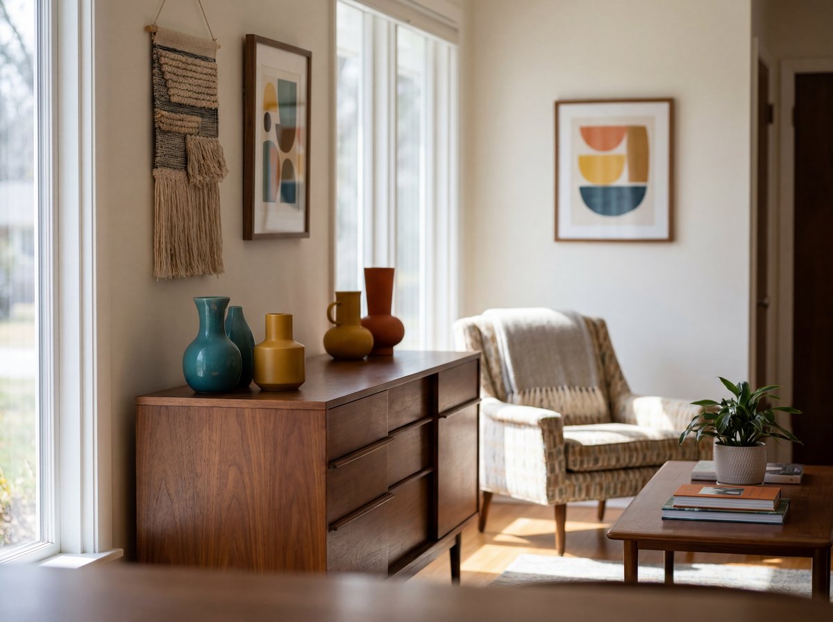
The One Rule That Saves Teal
Here is the rule that fixes the dated-teal problem. If you use teal, you must add a warm counterbalance.[3] Pure teal plus walnut plus white is the starter pack. Teal plus walnut plus mustard plus warm white is mid-century modern done right.
The counterbalance can be small: a mustard throw, a terracotta plant pot, an extra layer of warm wood. It just has to be present. The reason the 2015 teal rooms looked dated is that they ran teal cool against white cool with no warmth to pull it back to the period. Add one genuinely warm element and the whole scheme settles into the 1950s rather than the 2010s. The same logic applies in reverse: if you choose mustard or burnt orange as your accent, you rarely need a counterbalance because both are already warm.
The Three Pairings That Work
Three foundation-plus-accent combinations cover almost every MCM room.
- #FAF9F6 warm white + #7B4F2E walnut + #C9A84C mustard. The safest, warmest, hardest-to-get-wrong scheme. Good for first attempts.
- #F5ECD7 warm cream + #8B6355 teak + #CC6B2C burnt orange. The richest and most distinctly period-correct. Good for a statement living room.
- #FAF9F6 warm white + #7B4F2E walnut + #2D7D7D teal + a mustard or terracotta counterbalance. The classic teal scheme, with the warm counterbalance built in so it does not tip dated.
Any of the three can take a dark note for the warm neutrals to read against. A warm charcoal around #4A4035 works for a feature wall or a large upholstered piece without going cold, and it stays on the warm side of the neutrals rather than cutting against them.
Where Each Color Goes in the Room
Color placement is as important as color choice. The foundation neutrals carry the walls, the largest upholstered pieces, and the floor. The accent shows up two or three times, always on something you could carry out of the room: an accent chair, a pair of throw pillows, a piece of graphic art, a stripe in the rug. The accent should never be on the walls and never on the biggest sofa, because at that scale a bold MCM accent overwhelms the room and dates fast.
Wood is its own layer. Treat walnut and teak as a color in the scheme, not as a neutral that does not count. A room with five walnut pieces and no tonal variation reads flat, the same way an all-one-paint-color room would.
Paint Colors That Match the Palette
If you can paint, a few specific colors translate the hex codes into real wall paint. For the warm white foundation, look at Benjamin Moore White Dove, Sherwin-Williams Alabaster, or Farrow and Ball Pointing, all warm whites that hold their warmth under both daylight and lamp light. For a warm-cream alternative, Benjamin Moore Swiss Coffee or a soft greige works. For a warm charcoal accent wall, a deep warm-toned brown-black rather than a cool slate keeps it on-period.
The test for any paint chip is to hold it against a walnut sample. If the white makes the walnut look yellow or orange, the white is too cool, that contrast is the tell. A correctly warm white sits next to walnut without fighting it. Do the same test with lamp light on, not just daylight, because MCM rooms rely on warm 2700K lamps and a paint color can shift noticeably between the two. Renters who cannot paint get the same result by layering, warm-cream textiles and warm wood pull a cool builder-white wall warmer by association.
The Four Color Mistakes That Date a Room
Most MCM palette failures trace back to the same handful of errors, and each one has a specific fix.
Cold white walls. Pure #FFFFFF is the most common mistake. It reads clinical, it makes walnut look yellow, and it pulls the whole room toward a builder rental instead of the 1950s. The fix is always a warm white near #FAF9F6.
Teal with no warm counterbalance. Teal run only against white and walnut is the starter pack, and it is what makes a room read as a dated 2015 look. One genuinely warm element, a mustard throw or a terracotta pot, settles it back into the period.
Two full-saturation accents. A second bold accent at full strength is one of the fastest ways to make an MCM room feel busy and off-period. The style is one accent, done boldly, against warm neutrals. One accent, two or three placements, and nothing else competing.
Treating wood as a non-color. Five walnut pieces with no tonal variation reads as flat as an all-one-paint room. Walnut and teak are colors in the scheme, so vary the tones and let some lighter and darker warm wood play against each other.
Three Things to Settle Before You Pull Paint Chips
Three questions are worth settling before any of the shopping starts, because each one changes what you buy.
Can MCM use a dark or moody wall color? Yes, but only a warm dark. A warm charcoal near #4A4035 or a deep brown-black works for a single feature wall or a large upholstered piece. A cool slate or true black reads contemporary, not mid-century.
Does every room in the home need the same accent? No, but the foundation should stay consistent. The warm white, warm cream, and warm wood can run through the whole home, while each room can carry its own single accent. What ties the house together is the warm neutral base, not one repeated accent color.
Is gray ever a mid-century modern color? Cool gray is not. It is the fastest way a room drifts from MCM into generic contemporary. If a gray is unavoidable, a warm greige that leans toward cream is the closest acceptable substitute, and even then the wood and textiles have to pull it warm.
See Also: More Mid-Century Modern Guides
- the history and origins of mid-century modern design
- mid-century modern living room ideas for real apartments
- The complete Mid-Century Modern guide
Where to Go Next
Eight hex codes, three accents, three pairings, and one rule: whenever teal leads, something warm has to answer it. The Complete Mid-Century Modern Interior Design Guide covers the whole style room by room, including the furniture and the room-by-room layouts.
Sources.
- [1] housebeautiful.com: Mid-Century Modern Room Ideas
- [2] thespruce.com: Mid-Century Modern Style: A Complete Guide
- [3] apartment therapy: How to Avoid the Mid-Century Modern Airbnb Look
Frequently asked
What colors are used in mid-century modern design?
Warm neutrals form the base, warm white near #FAF9F6 and warm cream near #F5ECD7, plus warm wood tones like walnut and teak. One bold accent goes on top, usually teal, mustard yellow, or burnt orange.
What paint colors work with walnut mid-century modern furniture?
A warm white such as #FAF9F6 is the standard wall color. Warm cream and a warm charcoal also work. Avoid pure #FFFFFF, which makes walnut look yellow and reads cold.
What is the most popular mid-century modern color?
Teal is the most popular accent, and also the most overused. Mustard yellow is the second most popular and tends to age better because it warms the palette.
How do I keep teal from looking dated in a mid-century modern room?
Add a warm counterbalance. Pair teal with walnut, warm white, and a mustard or terracotta element. Teal run only against white and walnut is what reads as a dated 2015 look.
How many accent colors should a mid-century modern room have?
One. Mid-century modern uses a single bold accent against warm neutrals. A second full-saturation accent is one of the fastest ways to make the room feel busy and off-period.
There are 15 more Mid-Century Modern guides.
This is one room of the set. The pillar links to all of them, and new guides go out by email first.
Read the Mid-Century Modern guide