Table of Contents
The beige problem.
The 83-upvote r/japandi thread "I guess my style is Japandi" is not a style discovery post. It is a texture discovery post. The user has a neutral room - warm white walls, light wood, natural materials - and has just realized that what makes it Japandi is not the palette. It's the material register underneath the palette: the grain visible in the wood, the slub in the linen, the slight asymmetry in the handmade ceramic on the shelf. The community's response is immediate confirmation: "yes, that's exactly what it is."
Japandi operates on two passes. The first pass reads as calm, pale, and minimal. The second pass - the one Cate St Hill describes - finds "lots of little interest from the details." Both passes are required. A room that only delivers the first pass is a hotel lobby. A room that delivers both is the anti-anxiety space the r/japandi community is consistently chasing: the visual equivalent of a long exhale.
The wabi-sabi principle explains why imperfection is structural here, not incidental. Each of the five elements below is chosen because it brings surface variation into a calm room - grain, weave, irregular glaze, living texture - without breaking the quiet. That's the brief. Build from it.
Natural Wood Platform Furniture · $398.97
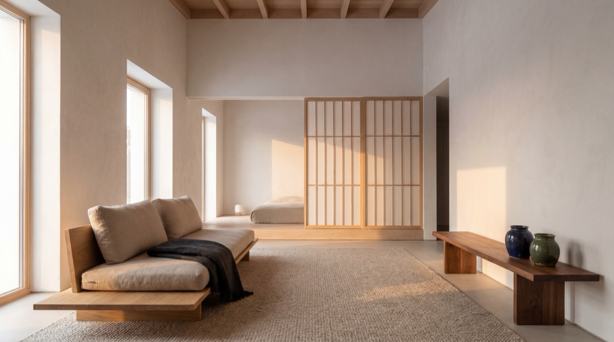
The defining spatial move in Japandi is low. Platform beds, low-profile chairs, floor cushions - the eye-level drop signals a Japanese spatial principle that Scandinavian design reinforces through its own preference for clean, horizontal furniture lines. White oak and light ash are the correct wood tones; golden oak, cherry, and espresso all read wrong. The IKEA POÄNG chair is a recognized budget Japandi gateway piece - its organic birch frame and minimal silhouette hit both parent aesthetics at once. Pair it with a bamboo side table and a floating shelf, and the furniture layer is set.
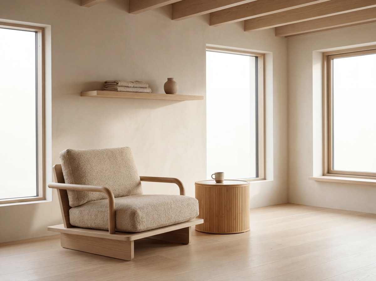
E1 Receipt - Natural Wood Platform Furniture
The platform bed eliminates box spring height - the low profile is the Japandi signal, not the finish color. Facebook Marketplace runs these at $50--80 used, which also adds the wabi-sabi patina that makes new furniture read as warmer. The POÄNG cushion in natural/beige linen reads correctly; avoid the darker upholstered versions. IKEA As-Is sections regularly carry used POÄNG chairs at $40--60. Cate St Hill describes sourcing "flea market finds from Japan alongside modern pieces" as the correct approach - old and new together is better than a matched set.
Linen and Organic Textiles · $254.96
Linen is the material that does the most atmospheric work per dollar in a Japandi room. The r/japandi community is specific about what breaks the warmth: polyester "linen look" bedding and synthetic throws lose the surface variation - the slub, the drape, the way natural linen wrinkles and softens - that makes the material register as natural. IKEA PUDERVIVA is the most-recommended budget entry: it softens correctly after washing, which is part of the wabi-sabi point. The textile that improves with age is more Japandi than the one that stays pristine.
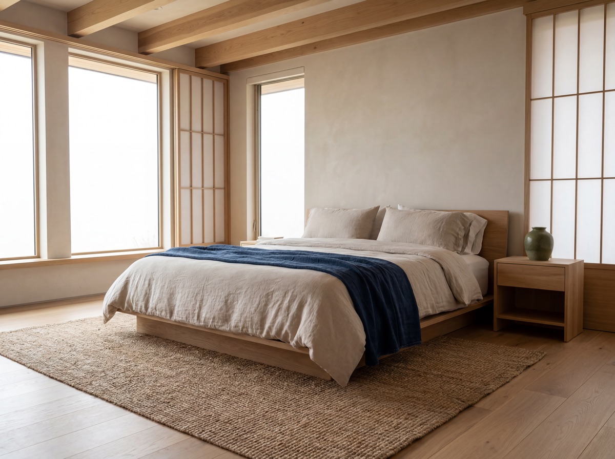
E2 Receipt - Linen and Organic Textiles
The jute flatweave handles the floor without announcing itself - visible texture, low visual volume, correct Japandi behavior for a rug. The organic cotton sheet set is the budget layer underneath the linen duvet; true linen sheets from Cultiver or Rough Linen run $200--300 per set but soften significantly more over time. The stonewashed throw moves between bed, sofa arm, and chair - single piece, multiple positions. For families with pets: Ruggable makes washable jute-look flatweaves in natural tones at $179 for a 5x7.
Wabi-Sabi Ceramics · $118.96
Handmade ceramics are the most affordable wabi-sabi lever in a Japandi room. The community is specific about what the wrong version looks like: matching ceramic sets in identical glazes, arranged symmetrically, read as a spa treatment room rather than a lived-in space. The correct version has a mug with a thumb dent, a vase with an irregular lip, containers that belong to the same material family but look as if they arrived from different sources over time. Jarret Yoshida's framework applies here directly: every element must "serve a purpose while also contributing to the overall beauty of the room." The ceramic mug that is also the morning ritual object; the vase that also holds one branch.

E3 Receipt - Wabi-Sabi Ceramics
Local potters and Etsy sellers run handmade mugs at $25--45 each, which costs more but adds genuine wabi-sabi provenance. Thrift and antique stores are the correct sourcing channel for ceramic vases in this style - the goal is not a matching set but pieces that belong together by material family rather than matching SKU. The incense holder has a secondary function: incense smoke movement itself is a biophilic element, adding gentle animation to a still room. For families: swap fragile handmade ceramics for thrifted stoneware, which already survived decades of use and reads as more authentically wabi-sabi.
Hidden Functional Storage · $176.97
Hidden storage in Japandi is not about tidiness - it is about the Japanese concept of ma, the productive use of negative space. An object that serves a function AND contributes beauty belongs on the surface. Everything else disappears. Cate St Hill puts this directly in her transcript: "I'm one of those surface-level tidy people... it's just a matter of having good storage and having everything hidden away." The KALLAX with door inserts achieves this at budget tier: the closed face reads as quiet. A quiet surface is where the ceramic vase and the single plant earn their visual weight.
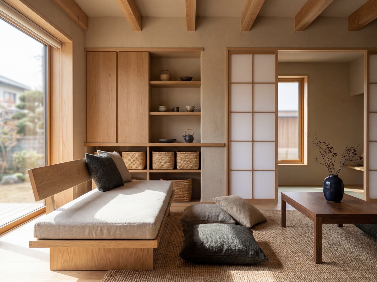
E4 Receipt - Hidden Functional Storage
The KALLAX door inserts ($10 each) transform an open shelving unit into a closed-face storage piece - a significant function shift for $20. The linen drawer organizers are invisible when the drawers are closed but reduce the friction of the hidden-storage commitment by one level. Bamboo baskets on top of or inside open KALLAX cubes handle the "items that don't fit anywhere else" category without exposing the contents. The r/japandi community is consistent: visible clutter is the fastest way to break the calm register, regardless of palette and materials.
Biophilic Accent · $97.96
Biophilic connection in Japandi is structural, not decorative. Cate St Hill's design philosophy is explicit: "I'm a big believer in biophilic design, which is all about connecting with nature and bringing those natural elements inside, whether it's with plants, natural materials, wood, texture. I'm all about tactility." The single plant in a matte ceramic planter on a bamboo stand is the Japandi plant sequence - one sculptural form, positioned intentionally, elevated off the floor. The kokedama (Japanese moss ball) is the advanced version: living plant, handmade moss vessel, and pebble tray combine into a single object that reads as both functional and meditative. Over-planting tips the room toward cottagecore; the r/japandi community is consistent on this boundary.
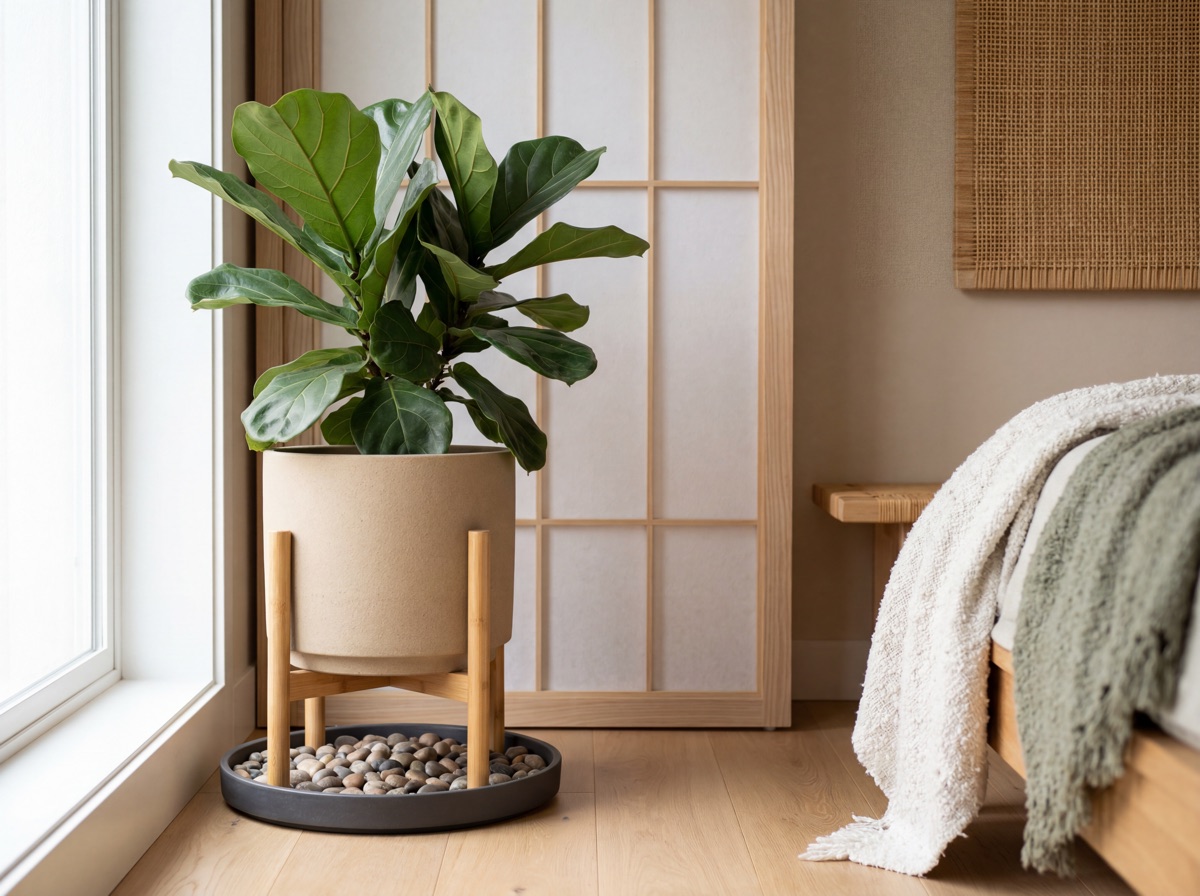
E5 Receipt - Biophilic Accent
Fiddle leaf figs and ficus varieties work in Japandi because of their sculptural form - one plant with strong vertical geometry reads as intentional. A shelf of trailing pothos reads as a plant collection. The kokedama kit provides an accessible entry to the practice; a handmade kokedama from a local plant shop adds wabi-sabi provenance. River pebble trays serve as both drainage catcher and material accent - the visible pebbles add surface texture the floor absorbs, completing the biophilic ground plane between plant and room.
Japandi vs Scandinavian.
The most-asked question in the cluster per VOC research - both styles share natural materials and a neutral palette, but the philosophical DNA separates them enough to matter in practice.
| Factor | Japandi | Scandinavian |
|---|---|---|
| Philosophy | Wabi-sabi + hygge -- imperfection and warmth together | Hygge + lagom -- warmth and appropriate balance |
| Color palette | Warm white to near-black -- no bold accents | Optical white dominant -- brighter accents acceptable |
| Wood tone | Light ash, white oak only -- golden oak is wrong | Birch, pine, lighter Nordic oak -- wider range |
| Ceramics | Handmade, irregular, intentionally imperfect | Clean-lined, mass-produced acceptable |
| Plant approach | One intentional plant -- kokedama or single sculptural form | More candles, more layered textiles -- plants optional |
| Failure mode | The beige problem -- neutrals without material texture | Over-hygge -- too many candles, too much cozy clutter |
The $472 entry path.
Elements 2, 3, and 5 only -- the entire textile, ceramic, and biophilic layer before committing a dollar to furniture. Changes the material register of any room immediately.
Frequently asked questions.
What is Japandi interior design?
Japandi is a hybrid design philosophy that combines Japanese minimalism - specifically wabi-sabi, the acceptance of imperfection and natural aging - with Scandinavian functionality and hygge warmth. The word is a portmanteau of Japan and Scandinavia. The style emerged in mainstream interior design around 2016. Its defining principles: natural materials (white oak, ash, bamboo, linen, handmade ceramics), a neutral palette running from warm white to near-black, low-profile furniture that positions the room from the floor up, and wabi-sabi acceptance of wear and imperfection as beauty signals. The aspiration, consistent across r/japandi and the broader r/InteriorDesign community, is a home that functions as an anti-anxiety space - the visual equivalent of a long exhale.
What is the difference between Japandi and Scandinavian design?
The materials and palette overlap significantly; the philosophy separates them. Scandinavian design is anchored in hygge (coziness and warmth) and lagom (the Swedish principle of appropriate balance - not too much, not too little). Japandi adds wabi-sabi: the deliberate embrace of imperfection, wear, and handmade irregularity as beauty signals rather than flaws. Scandinavian design accepts clean-lined, mass-produced ceramics and symmetrical arrangements. Japandi calls for handmade pieces with visible irregularity - the thumb dent in the mug, the uneven glaze on a vase. Scandinavian palettes can run brighter and include optical white and color accents; Japandi runs warmer and darker, with charcoal and deep sand anchoring the neutrals. The r/japandi community frames it well: Scandinavian is a visual style; Japandi is a philosophy you can see.
What colors work best in Japandi interior design?
The palette runs from warm white to near-black - all within the muted, nature-derived range, with no bold color. The four practical anchors: warm white (specifically warm rather than cool blue-white), light ash and sand (the secondary neutral that reads in the linen and ceramic layer), charcoal or deep warm gray (the accent that grounds the room), and natural wood tones (light ash, white oak, blonde pine - never golden oak, cherry, or espresso). Homes and Gardens confirms the palette runs "warm browns and deep charcoal" as valid darker hues, wider than most guides suggest. The community's clearest summary: Japandi is not just cream - it runs warm white to near-black, with texture doing the work within that range.
How do I do Japandi on a budget?
Start with textiles (linen bedding, jute rug, stonewashed throw) and one handmade ceramic. Those two categories deliver the highest Japandi-to-dollar return because they change the material register of the room - the thing that separates a Japandi space from a beige hotel room - without committing to expensive furniture. IKEA PUDERVIVA linen duvet at under $80 and one matte stoneware mug at $11--20 are both valid starting points. The furniture question (platform bed, POÄNG chair) is second-phase. For any wood furniture, Facebook Marketplace and thrift stores produce more authentic results than new laminate: worn natural wood is more wabi-sabi than factory-fresh pine. The entry path in this guide (Elements 2, 3, and 5) covers the entire textile, ceramic, and biophilic layer before committing a dollar to furniture.
Can Japandi work in a family home with kids or pets?
The maintenance anxiety is the most honest pain point in r/japandi - "I have a toddler. Japandi is impossible" appears in multiple threads. The practical answer is that wabi-sabi already accepts wear, patina, and evidence of use as design virtues. The worn edge of a linen throw after two years, the scratched surface of a white oak table - these are more Japandi, not less. Family adaptations: substitute thrifted stoneware for fragile handmade ceramics (thrifted pieces already survived decades of use and read as more authentically wabi-sabi), use a washable jute-look rug (Ruggable makes flatweaves in natural tones), and elevate the biophilic accent on a stand rather than a low surface. Hidden storage (Element 4) becomes more critical in a family home, not less - the negative space principle depends on everything non-display-worthy disappearing completely.
What is the most common Japandi decorating mistake?
The beige problem - building the palette without building the material register. A room can be perfectly on-palette (warm white walls, linen throw, white oak table) and still feel flat or hotel-like. The material variation - the grain in white oak, the slub in linen, the thumb dent in a handmade ceramic - is what the neutral palette is designed to reveal. The second most common mistake: wrong wood tones. Golden oak, red-toned cherry, and dark espresso all signal different styles; the correct Japandi woods are light ash, white oak, and blonde pine. Third: over-planting. Japandi's biophilic layer is one intentional plant in a vessel with visual weight; a shelf of trailing pothos signals a plant collection, not a Japandi room. And fourth: the IKEA LACK substitution. The LACK's laminate surface has no grain and no material weight. The KALLAX and the POÄNG both earn their place; the LACK does not.