AI home design guides for your city, budget, and style.
Downloadable design guides, room style lookbooks, and budget calculators - tailored to specific cities and salaries using AI-rendered room designs. Know what you can afford before you start.
BROWSE GUIDESDesign advice built for your budget, not someone else's.
Your rent in Austin is different from NYC. Your 600 sqft studio needs different furniture from a 1,200 sqft loft. Our guides factor in where you live, what you earn, and the space you have.
Your City. Your Salary. Your Room.
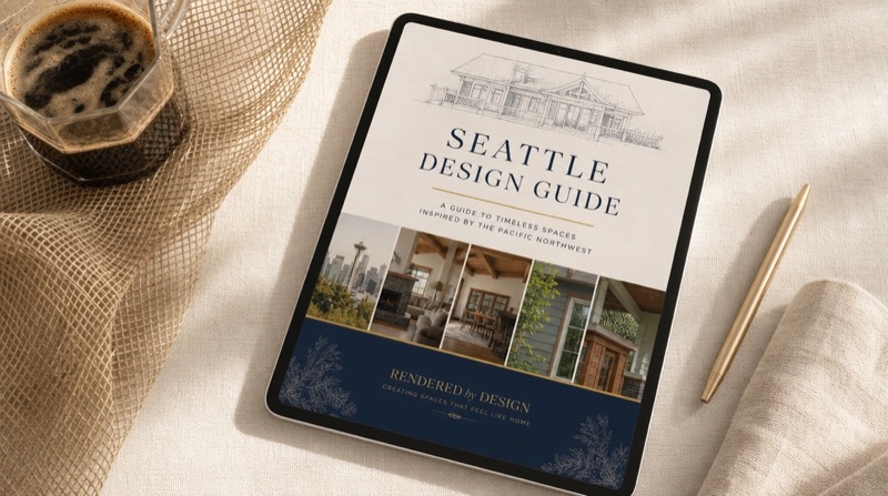
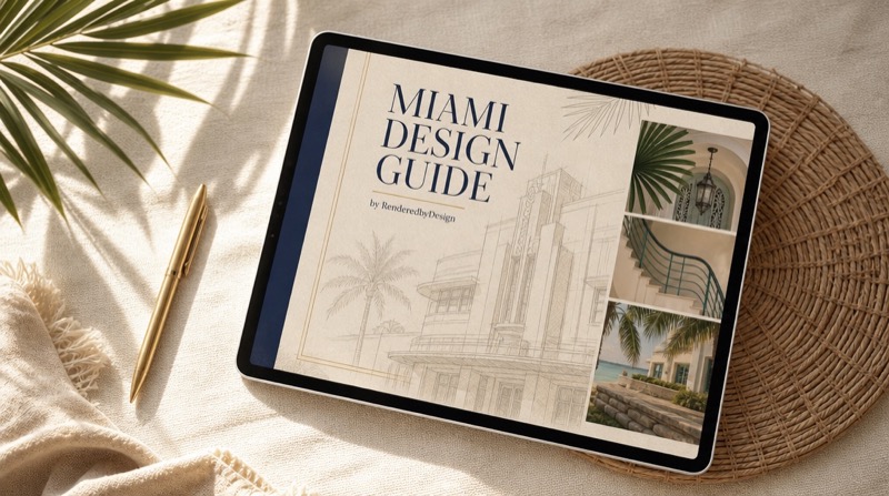
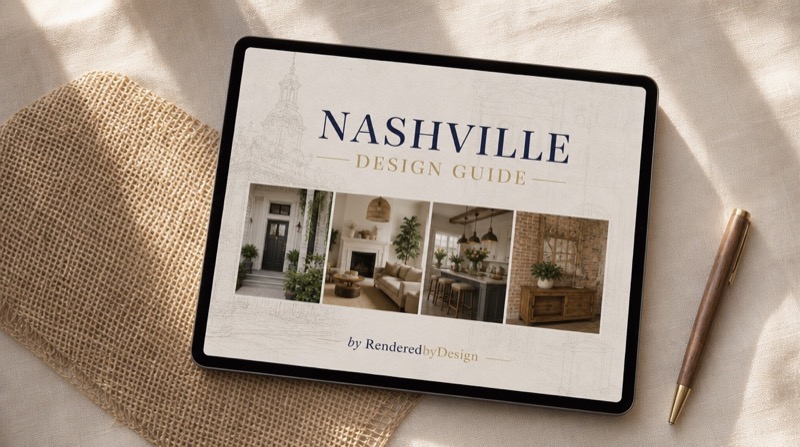
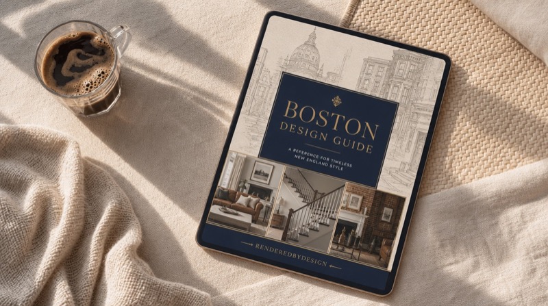
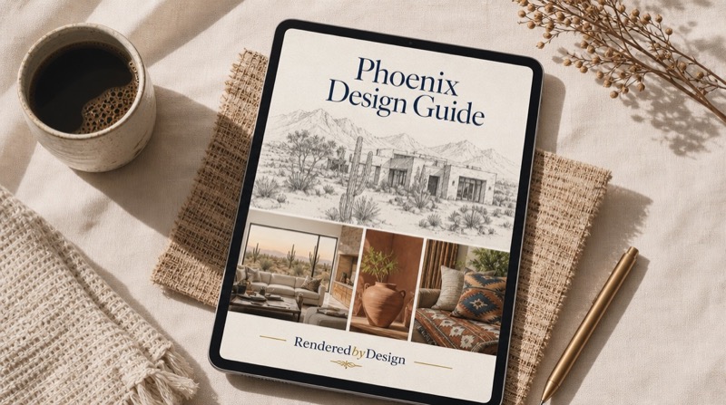
Design guides for your city.
AI-rendered room designs calibrated to your city's rent, your salary, and your actual square footage. Every item priced, every link included.
SHOP ALL GUIDES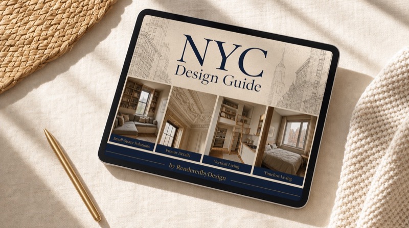

See it before you spend it.
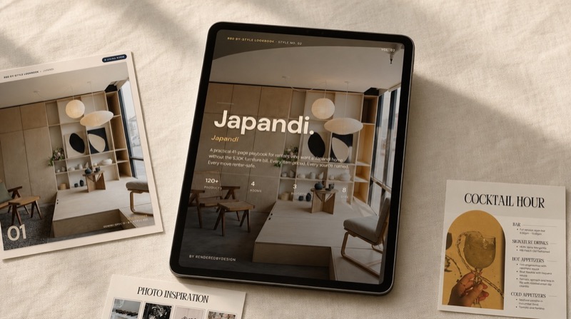
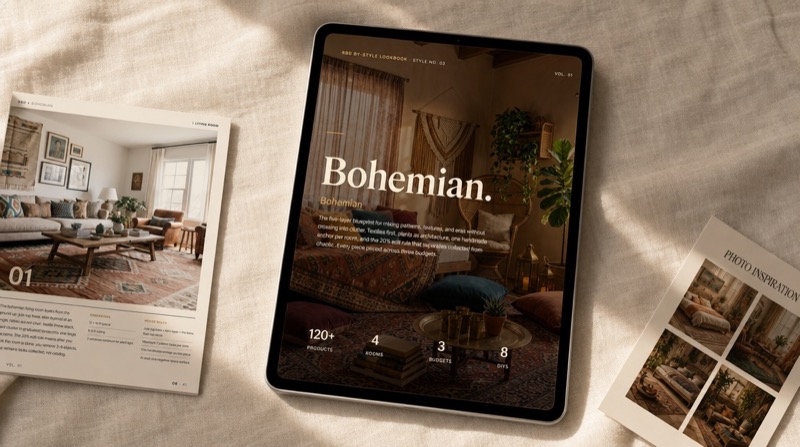
Photorealistic room renders organized by style - Scandinavian, Mid-Century Modern, Industrial, Japandi, and more. Each lookbook includes product links and budget breakdowns.
SHOP LOOKBOOKS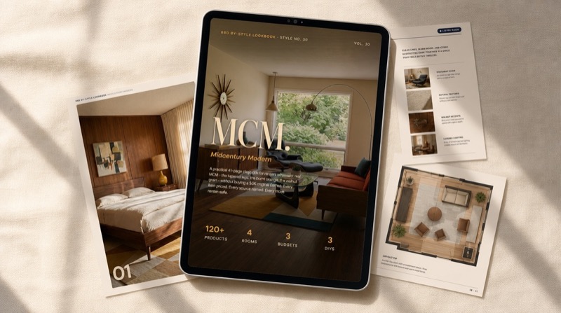
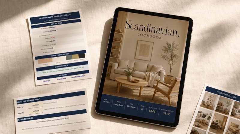

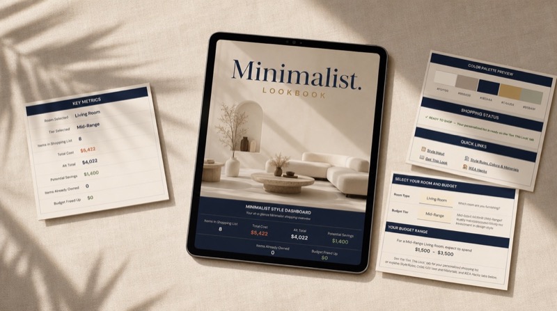
Beautiful rooms. Real numbers.
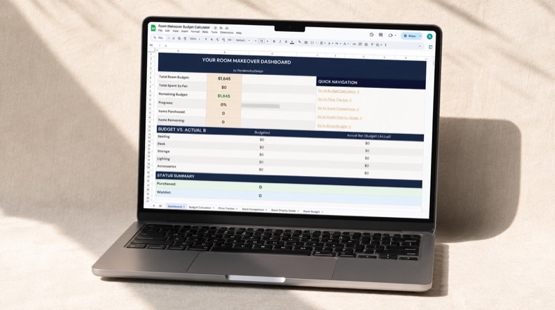
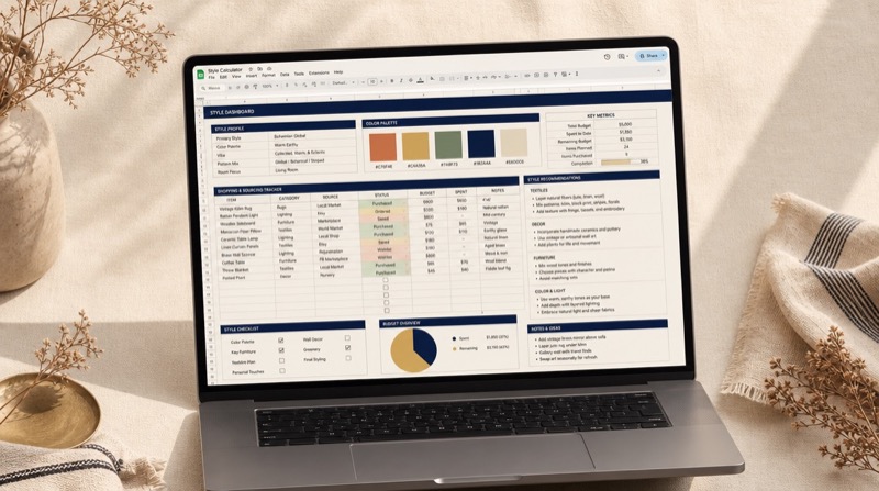
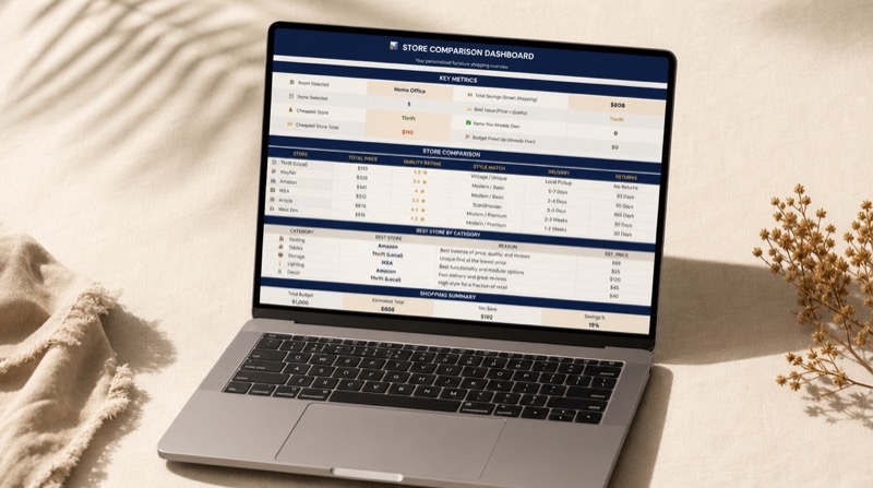
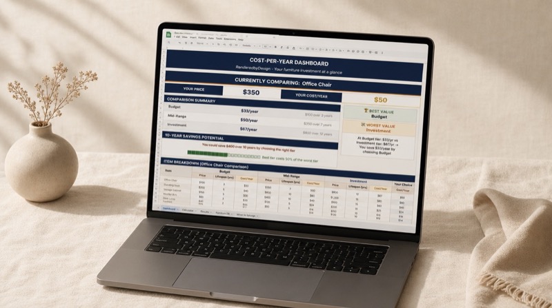
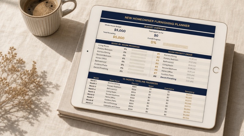
Plug in your salary, your city, and your room - get a complete furniture budget with cost-per-item breakdowns, priority rankings, and product recommendations.
SHOP CALCULATORS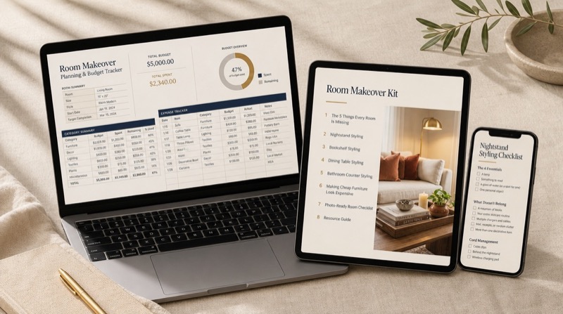
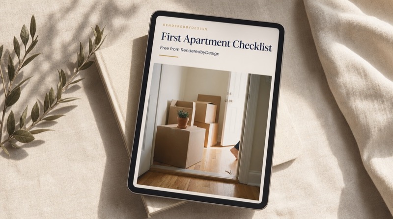


Get the Free First-Apartment Checklist
Join the list. Get a free moving checklist, early access to new city guides, and weekly design inspo for real budgets.
We respect your privacy. Unsubscribe anytime. No spam, ever.
Questions you probably have.
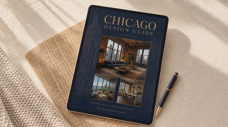
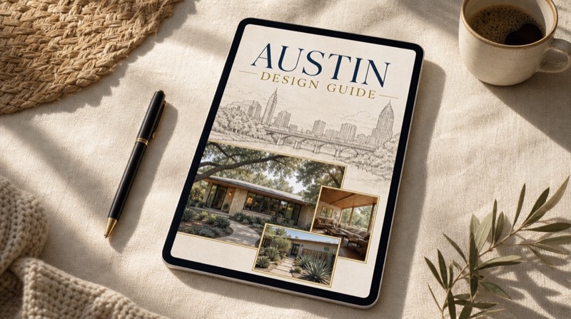
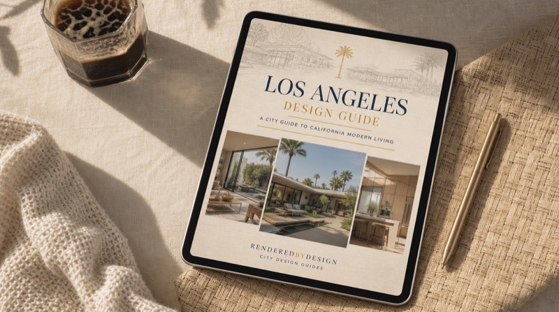
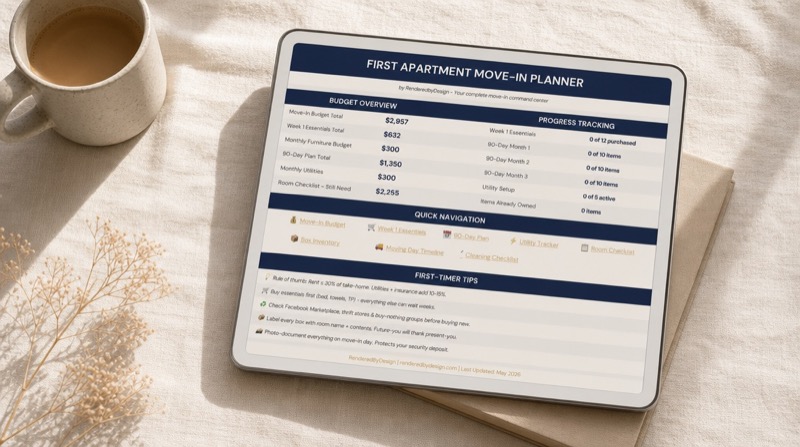
Each guide includes 10+ AI-rendered room designs (living room, bedroom, home office, kitchen, bathroom), furniture picks from IKEA, Amazon, and Wayfair with direct links and prices, a color palette per room, a printable budget worksheet calibrated to the city's cost of living, and renter-safe alternatives. Guides are 20-30 pages.
Our AI renders simulate realistic interiors using actual furniture products available at IKEA, Amazon, and Wayfair. While the renders are AI-generated visualizations, every item shown is a real product you can purchase at the listed price.
We cover 25+ major US cities including New York, Los Angeles, Chicago, Austin, Denver, Seattle, Miami, Portland, Nashville, and more. New cities are added regularly based on viewer demand.
Yes. All digital products come with a 30-day refund policy. If a product doesn't meet your expectations, email renderedbydesign@gmail.com for a full refund.
Yes. Every furniture and decor item includes direct purchase links. Some are affiliate links, meaning we may earn a small commission at no extra cost to you. This is disclosed on every product page.
Yes. Our budget calculations use real salary data from the Bureau of Labor Statistics and cost-of-living indices for each city to recommend a realistic furniture budget.
City Design Guides and Room Style Lookbooks are delivered as high-quality PDFs. Budget Calculators are Google Sheets templates that you copy to your own Google Drive. All products are available for instant download.
Pinterest shows beautiful rooms with no prices, no purchase links, and no idea if you can afford any of it. Our guides show every item priced, linked, and calibrated to your city's cost of living.
Not currently, but we add new cities regularly based on viewer demand. Subscribe to our email list and you'll be the first to know when your city drops.
We publish daily room design content on YouTube and social media @RenderedbyDesign. Each video features a specific city, budget, and design style. Follow us for free to see new designs every day.
Watch the Full Room Tours
New AI-rendered room designs every day on YouTube - your city, your budget, your style.
SUBSCRIBE ON YOUTUBE