Table of Contents
Light cottagecore and dark cottagecore.
Cottagecore emerged on TikTok during 2020 pandemic lockdowns as a counter-cultural longing for rural simplicity - the anti-corporate, anti-urban fantasy of a life spent tending herbs, pressing flowers, and reading books in a room that smells like beeswax and dried lavender. The style arrived fully formed with a sourcing ethic: thrift stores, estate sales, Etsy, and farmers' markets rather than big-box retail. The authenticity marker the community converges on is not visual but provenance-based: "someone made this." A crochet throw from Etsy qualifies. An Amazon bundle labeled "cottagecore throw" does not.
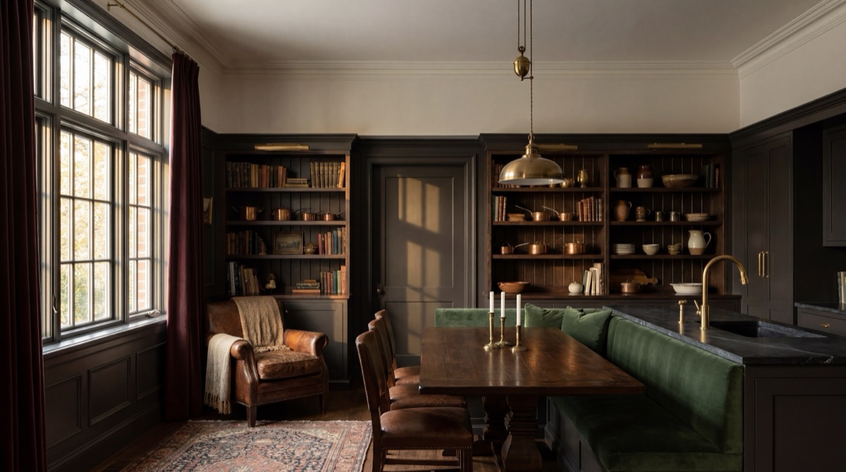
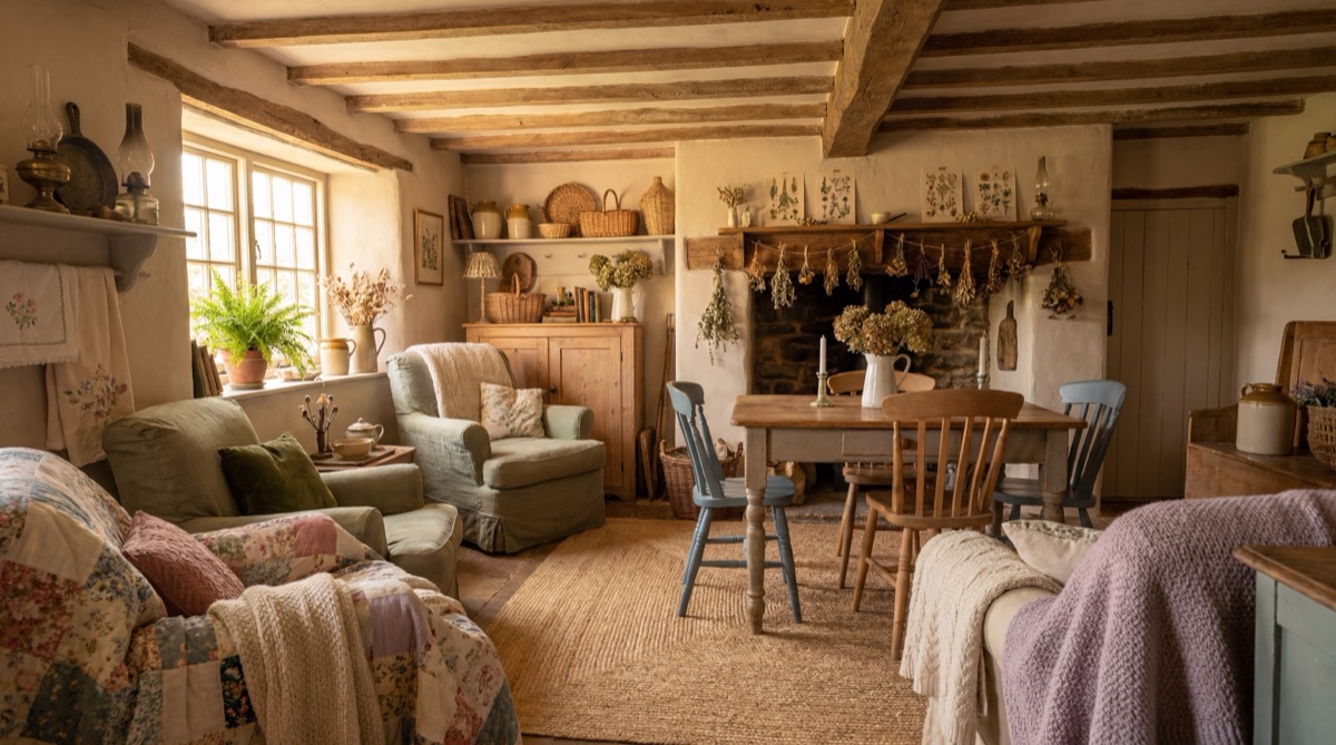
The r/cottagecore community's 6,733-upvote debate - "When did cottagecore get so conservative?" - captures the style's central tension. What the debate reveals is that cottagecore has two schools with meaningfully different palettes, botanical approaches, and emotional registers. Light cottagecore uses cream, blush, sage, dusty rose, and soft lavender - fresh florals, spring pastoral imagery, rattan furniture, and bright airy rooms. Dark cottagecore uses forest green, cognac, ochre, oxblood, and dried botanicals in deep earthy tones - Victorian moody, dried lavender rather than fresh, dark velvet rather than light cotton, and a general acceptance that a cottagecore room should look worn, personal, and slightly imperfect.
Both schools share a rejection of mass-market cottagecore's most sanitized forms: the white room with a single dried flower wreath and a "gather" sign. The five elements below are the scaffolding for either school. The receipt items can be calibrated for light or dark depending on which palette you are building toward. The entry path skews light. The full build has dark alternatives noted throughout.
The Botanical Foundation · $189.96
The botanical foundation is the non-negotiable core of cottagecore's visual language, and it is where the style diverges most sharply from every adjacent aesthetic. Biophilic design requires living plants. Cottagecore does not - in fact, some of the most authentically cottagecore botanical approaches are entirely dried: lavender bundles hung from ceiling hooks, wheat sheaves in a crock by the door, pressed flowers under glass on the wall. The dried botanical approach is not a budget concession; it is a signal of the style's willingness to embrace impermanence and decay as part of the room's character. A wilting dried flower arrangement is correct cottagecore. A perfect faux flower arrangement is not. The receipt below anchors the botanical foundation with a dried lavender bundle (the single most recognizable cottagecore botanical element), a set of pressed flower wall art frames, and a live trailing pothos for the windowsill - the one living plant that works in cottagecore because it trails naturally and reads as cottage-grown rather than interior-designed. The kitchen herb garden kit extends the botanical logic into the functional layer: herbs in terracotta pots on a kitchen windowsill are simultaneously cottagecore, biophilic, and useful in a way that satisfies all three.
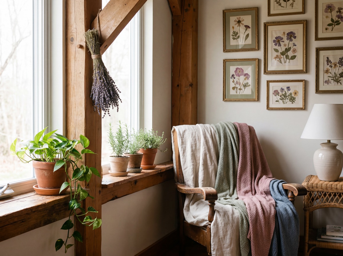
E1 Receipt - The Botanical Foundation
The Vintage Textile Layer · $219.96
The vintage textile layer is the surface area layer of cottagecore - the element that covers the largest percentage of a room's visible surfaces and establishes the style's register at room scale. Cottagecore textiles are defined by three qualities: natural fiber (linen, cotton, wool - never polyester), botanical or gingham pattern (the two most recognizable cottagecore motifs), and a handmade or vintage-adjacent quality (slightly irregular weave, embroidery, eyelet detailing, or aged appearance). The distinction from farmhouse textiles is important: farmhouse uses neutral, clean, and intentionally understated textiles. Cottagecore allows - and in the dark school, actively prefers - pattern, decoration, and a level of visual busyness that would read as "too much" in farmhouse or Japandi contexts. The linen cotton floral duvet cover is the highest-impact single piece in this element: a botanical-print bed cover transforms a bedroom's cottagecore register immediately and at lower cost than any furniture piece. The embroidered cotton table runner and gingham dish towels extend the textile layer into the functional objects of the kitchen and dining room, which is where cottagecore's domestic-life authenticity is most concentrated.
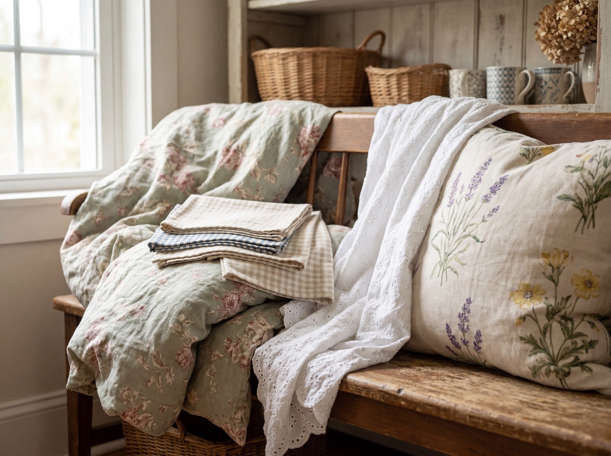
E2 Receipt - The Vintage Textile Layer
The Vintage Furniture Anchor · $279.97
The vintage furniture anchor is the structural centerpiece of the cottagecore room - the single piece that gives the entire layered aesthetic its architectural credibility. The sourcing ethos here is critical: cottagecore furniture is not purchased as new. The most authentic path is thrift stores and estate sales for rattan armchairs, rush-seat dining chairs, whitewashed pine side tables, and any piece of natural-material furniture with visible age. The receipt below lists retail equivalents for cases where thrift sourcing is not feasible, but the first recommendation for all three items is estate sale and thrift - and the budget savings are significant ($40-80 for the same rattan chair at a thrift store that retails for $149.99 new). The rattan or wicker accent chair is the single most important cottagecore furniture piece: it contributes natural material texture, botanical adjacency (rattan reads as a plant-derived material at room scale), and the vintage-pastoral character that no amount of textile layering can substitute. The rush-seat wooden dining chair pair extends the natural material logic into the dining space. The whitewashed pine side table completes the furniture set with a surface for candles, botanicals, and stacked vintage books.
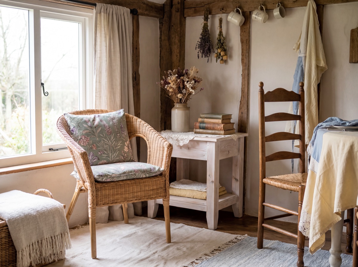
E3 Receipt - The Vintage Furniture Anchor
The Handmade + Artisan Layer · $164.96
The handmade and artisan layer is the authenticity signal layer of cottagecore - the element that separates a room that reads as genuinely cottagecore from a room that looks like a Pinterest mood board recreated in IKEA purchases. The principle is simple: every cottagecore room needs at least one object that was visibly made by a person rather than a machine. The sourcing hierarchy for this element: Etsy first (handmade crochet throws, ceramic mugs from independent potters, hand-poured beeswax candles, hand-embroidered textiles), thrift stores second (vintage handmade items at estate sales, mismatched ceramics with individual character, handcrafted brass candlesticks), and retail only for items that cannot plausibly be sourced otherwise. The crochet cotton throw is the most visible handmade signal: crochet construction is immediately readable as handwork at room scale, and the texture and slight irregularity of a crochet throw reads as made by someone in a way that no woven blanket does. The handmade-look mismatched ceramic mug set introduces the ceramic vessel dimension that is central to cottagecore's domestic life reference - mugs on open shelving, used and visible, are a stronger cottagecore signal than any decorative object. Beeswax taper candles in brass candlestick holders complete the element with the warm candlelight that dark cottagecore in particular requires.
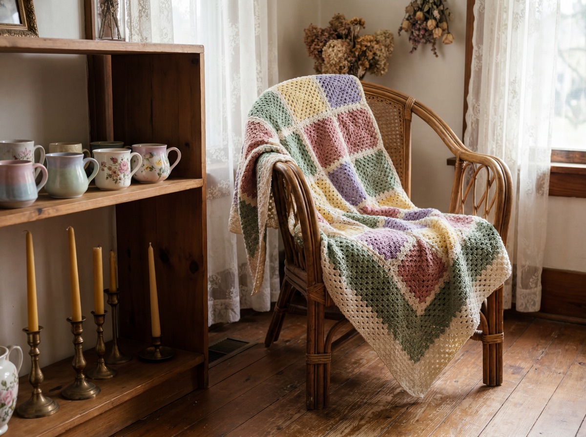
E4 Receipt - The Handmade + Artisan Layer
The Wall Story · $179.97
The wall story is the highest-leverage single investment in cottagecore for renters and small apartments - the element that transforms a white box into a cottagecore room before any furniture is changed. The cottagecore gallery wall differs from a generic gallery wall in three specific ways: the frames are mismatched (not matching frame sets from IKEA), the content is botanical (botanical illustrations, pressed flower art, watercolor florals, or vintage-style plant prints), and the arrangement is asymmetric and slightly imperfect rather than grid-aligned. The asymmetry and visual imperfection are functional cottagecore signals, not bad composition: a perfectly grid-aligned gallery wall reads as contemporary interior design. A slightly organic, asymmetric arrangement of mismatched botanical frames reads as something accumulated over time, which is the cottagecore goal. The botanical illustration print set provides the content layer. The mismatched vintage-style frames provide the provenance signal. The woven cotton wall hanging adds the textile dimension to the wall and fills the larger-scale areas that framed art alone leaves empty. In dark cottagecore, the wall hanging should be in darker tones - forest green, ochre, or deep rust rather than cream and sage.
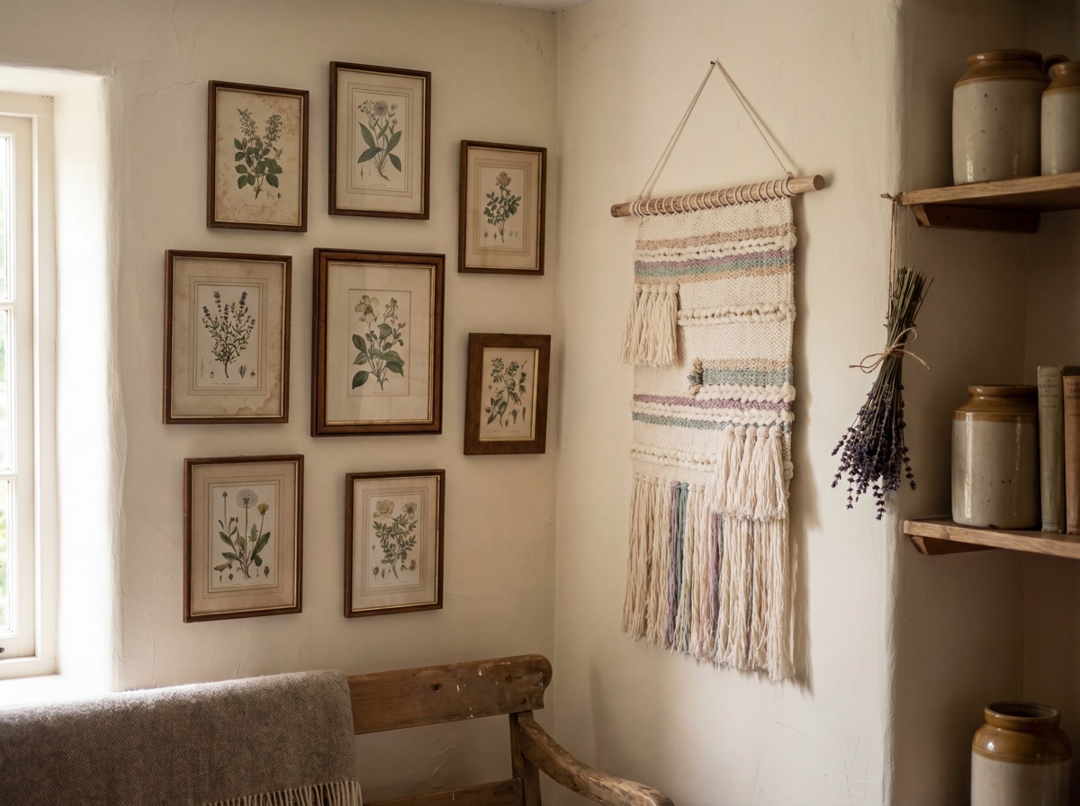
E5 Receipt - The Wall Story
Cottagecore vs. Farmhouse.
These two styles share rural aesthetic roots and natural material preferences. The distinction is sharp: farmhouse is clean, curated, and neutral. Cottagecore is personal, weird, accepting of decay, and deeply suspicious of the word "clean." A farmhouse room looks like it was styled for a photoshoot. A cottagecore room looks like someone lives in it -- someone who presses flowers, makes their own candles, and has too many ceramics to fit on one shelf.
| Dimension | Cottagecore Interior Design | Farmhouse Interior Design |
|---|---|---|
| Primary mood | Personal, layered, accumulated -- like someone actually lives here and has opinions | Clean, curated, neutral, photoshoot-ready -- beautiful but slightly impersonal |
| Pattern tolerance | High -- floral, gingham, botanical, embroidered all co-exist and are encouraged | Low -- typically one pattern at a time, neutral as the default |
| Botanical approach | Dried and live, imperfect arrangements, pressed flowers, herbs in terracotta pots | Fresh greenery, minimal styling, often faux stems in galvanized containers |
| Sourcing ethos | Thrift, Etsy, estate sales -- provenance matters, "someone made this" is the signal | Retail-friendly -- Magnolia, Target, World Market all produce credible farmhouse |
| Color palette | Two schools: light (blush, sage, cream) or dark (forest green, cognac, ochre, oxblood) | Primarily neutral: warm white, cream, beige, grey, shiplap tones |
| Imperfection | Embraced -- a wilting dried flower arrangement is correct cottagecore | Avoided -- farmhouse presentation is always clean and intentional |
The $189 entry path.
A room-scale cottagecore shift for under $200. Establishes the botanical layer, the natural fiber floor, the vintage ceramic signal, and the linen textile base that carries everything added afterward.
Frequently asked questions.
What is cottagecore interior design?
Cottagecore interior design is a style rooted in romanticized rural life - dried botanicals, vintage ceramics, handmade textiles, rattan furniture, botanical wall art, and beeswax candles layered into rooms that feel grown rather than assembled to impress. The aesthetic emerged from TikTok during the 2020 pandemic as an anti-corporate longing for pre-industrial simplicity, and carries a strong sourcing ethic: handmade, vintage, or visibly artisan items are the authenticity markers. "Someone made this" is the standard. An Amazon bundle labeled "cottagecore decor" fails it. A mismatched set of thrift store ceramic mugs, a crochet throw from Etsy, and a dried lavender bundle hung above a doorway pass it. The style has two schools - light (blush, sage, cream, spring pastoral) and dark (forest green, cognac, ochre, oxblood, Victorian moody) - but both share the fundamental commitment to rooms that feel personal, imperfect, and inhabited rather than staged.
What is the difference between light and dark cottagecore?
Light cottagecore and dark cottagecore are the two schools within the style, with distinct palettes and emotional registers. Light cottagecore uses blush, cream, sage green, dusty rose, and soft lavender - fresh florals, rattan in bright rooms, spring pastoral references, and a generally optimistic visual mood. Dark cottagecore uses forest green, cognac, ochre, oxblood, and dried botanicals in deep earthy tones - dried lavender rather than fresh, dark velvet rather than light cotton, candlelight rather than natural light, and Victorian country house references rather than spring pastoral ones. The r/cottagecore community's most-upvoted debate is essentially a defense of dark cottagecore against the sanitized Pinterest version that flattens the style toward its most commercial forms. Both schools share the authenticity principle and the sourcing ethos - the difference is only in palette and emotional register, not in what makes a room genuinely cottagecore.
What colors are used in cottagecore interior design?
Cottagecore uses two distinct palettes depending on the school. Light cottagecore: cream, blush pink, sage green, dusty rose, soft lavender, warm ivory, and muted botanical greens - the colors of spring wildflowers, fresh herbs, and a bright countryside cottage. Dark cottagecore: forest green, cognac, ochre, oxblood red, dried lavender (grey-purple), warm brown, and deep olive - the colors of autumn pastoral imagery, Victorian country house libraries, and rooms lit by beeswax candles. Colors that appear in both schools: warm cream as a base neutral, botanical greens in any saturation, and the natural tones of undyed linen and jute. Colors to avoid regardless of school: cool grey (reads contemporary urban), plain white (too clinical), and synthetic bright tones that have no reference in a natural pastoral environment.
How do I do cottagecore on a budget?
The core cottagecore budget strategy is to spend on ONE visible handmade or vintage anchor piece per room and budget everything else. Specific tactics: thrift stores and estate sales for vintage ceramics, rattan furniture, mismatched frames, and brass candlestick holders - the same rattan armchair that retails for $149.99 new costs $30-60 at an estate sale. Etsy for handmade crochet throws, pressed flower art, dried botanical bundles, and embroidered linens. For dried florals, buying bulk lavender from a farmers' market and pressing your own flowers is significantly cheaper than pre-made pressed flower kits. The gallery wall is the highest-leverage budget move: three botanical prints printed at a photo lab in mismatched thrift frames achieves the same visual effect as a $200 wall art set. The $189 entry path in this guide demonstrates the full strategy: one genuinely beautiful botanical piece, a neutral textile layer, one artisan-feel ceramic, and a natural fiber floor covering.
What plants work best for cottagecore interior design?
Cottagecore plant choices skew toward botanical heritage: trailing pothos (rustic, easy, reads as cottage windowsill), kitchen herb gardens (rosemary, thyme, lavender in terracotta on a kitchen windowsill - functional and visually correct), ferns in hanging baskets (especially for dark cottagecore), and wildflower-adjacent plants like chamomile or lavender in small pots. Critically, dried botanicals are fully legitimate in cottagecore - dried lavender bundles, dried wheat sheaves, pressed flowers under glass, and botanical watercolors all carry significant cottagecore weight. A cottagecore room can be entirely botanically authentic with zero living plants, which is one of the style's key distinctions from biophilic design, which requires living plants as non-negotiable. The one priority plant: a kitchen herb garden on a windowsill is worth prioritizing over ornamental houseplants if you have limited care capacity.
Can cottagecore work in a modern apartment?
Yes - cottagecore is one of the most apartment-friendly styles because it does not require architectural features. Key strategies: use textiles to override the architecture (floral duvet, linen curtains, jute rug, crochet throw establish the cottagecore register in any white-box apartment). Use vertical botanical layering - a pressed flower gallery wall, a dried lavender bundle above a doorway, botanical prints in mismatched frames, and a trailing pothos on a high shelf all work regardless of ceiling height. Address the lighting: modern apartments typically have recessed lighting that reads clinical. Swapping in warm Edison bulbs, adding a brass candlestick grouping, and using beeswax taper candles shifts the light quality toward the warm irregular quality that cottagecore rooms need. The wall art gallery is the single highest-leverage move for renters: it transforms a white box before any furniture is changed.
Want yours next?
One issue every Sunday. We'll plan your room with your city + salary.