Table of Contents
The starter pack. And how to escape it.
The 19,155-upvote r/malelivingspace "MCM starter pack" meme identified something real: walnut credenza + teal accent couch + Eames lounge knockoff + Sputnik chandelier + one snake plant = immediately identifiable as NOT personal. The combination reads as template because it is executed without interpretation - the objects are correct but the room has no point of view. Mid-century modern is a genuine design period with genuine design thinking behind it, and that thinking deserves better than the algorithm's output.
The MCM period runs approximately 1945-1969. The key designers solved specific problems: Charles and Ray Eames were making chairs that could be manufactured at scale using molded plywood and fiberglass - the shell chair was a manufacturing breakthrough, not just a design preference. Eero Saarinen's Tulip table eliminated the "ugly, confusing, unrestful world of legs" under tables. Hans Wegner's Wishbone chair solved the problem of a chair that read as beautiful from all three sides. These were answers to genuine questions. The MCM room that passes the anti-Airbnb test is one that understands those questions and applies them with personal interpretation, not catalogue execution.
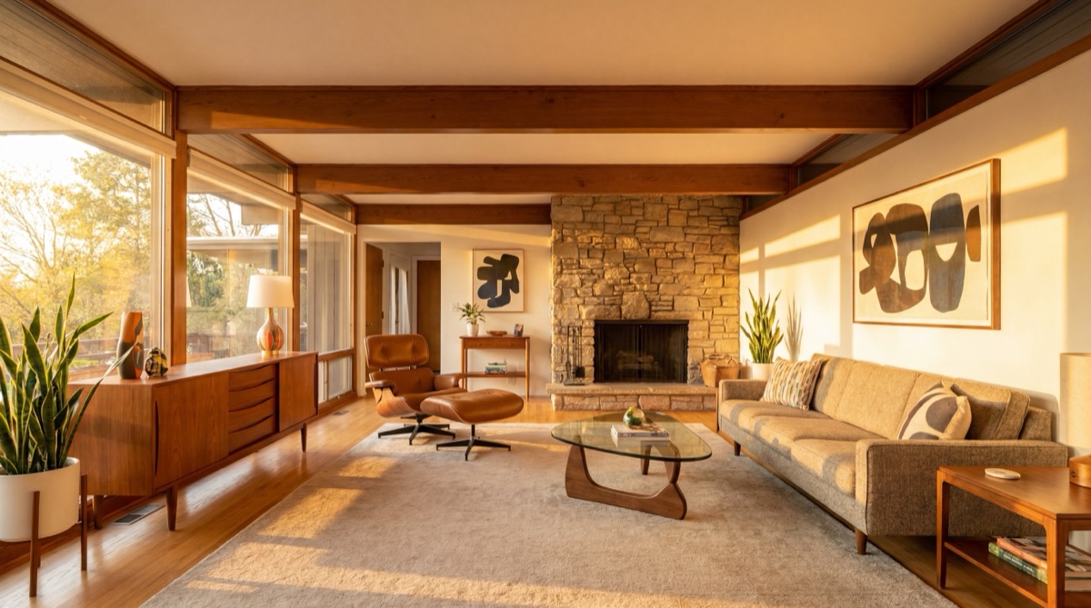
Five MCM principles drive the escape from the starter pack: warm wood tones not dark-stained (walnut, teak, and oak - not mahogany or ebony), organic forms with clean lines (the curve of the Eames shell chair is organic; the right angle of a contemporary sofa is not MCM), low-profile horizontal emphasis (credenzas, platform beds, and low sofas create the horizontal ground-hugging character specific to the period), one bold accent color done boldly (not scattered tentatively), and graphic artwork paired with sculptural lighting.
The Warm Wood Anchor · $569.97
The warm wood anchor is the structural foundation of mid-century modern interior design - the element that establishes the period's characteristic warmth and grounds every other piece in the room. Walnut is the canonical MCM wood: its warm chocolate-brown tone with visible grain is what distinguishes authentic MCM warmth from the dark-stained or whitewashed finishes that look adjacent but miss the period. The 60-inch low-profile credenza or media console is the signature MCM horizontal statement - a piece that hugs the wall at low height, carries the room's storage function, and presents tapered or splayed legs as its primary architectural detail. The solid oak or walnut coffee table with tapered legs continues the warm wood story at the room's center, and the walnut-toned floating wall shelves extend the horizontal emphasis upward while maintaining the period's characteristic lightweight, architecturally integrated aesthetic.
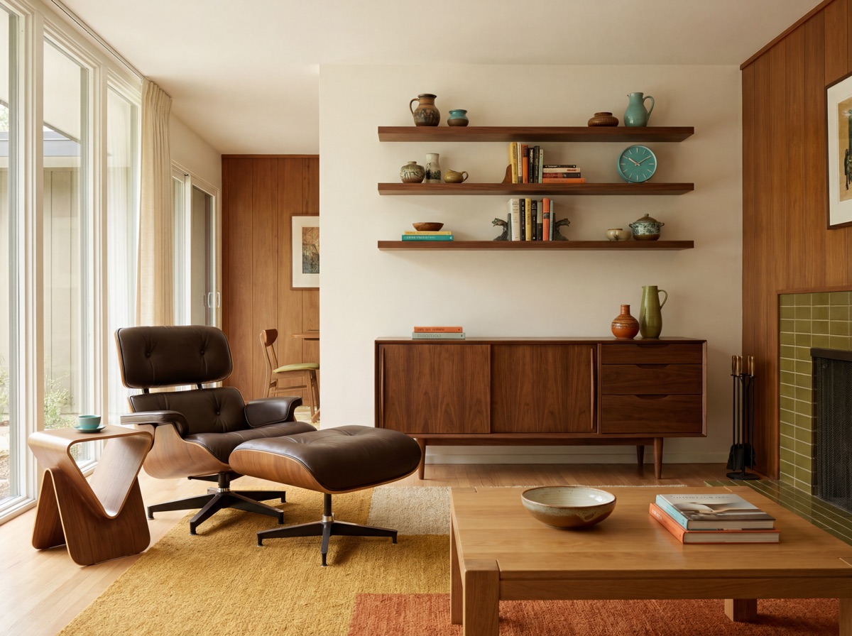
E1 Receipt - The Warm Wood Anchor
The Organic Form Layer · $969.97
The organic form layer is where MCM's most recognizable silhouettes live and where the period's design thinking is most legible. The characteristic MCM sofa has tapered legs that lift it off the floor (a visual lightness that distinguishes MCM from contemporary platform upholstery), a low profile that follows the period's horizontal ground-hugging emphasis, and an upholstery choice that is warm rather than cold: warm linen, natural boucle, or a muted tone that lets the wood leg structure remain visible and important. The replica tier note: Article and Castlery both produce quality MCM-inspired sofas in the $400-800 range that are genuinely hard to distinguish from the originals in a residential setting. The Eames-inspired shell chair replica is the clearest MCM accent seat option at the $89.99 price point - the molded plastic form is iconic and immediately readable as the period. The tulip base marble side table (Saarinen-inspired) introduces the sculptural round base leg that appears nowhere else in the standard MCM vocabulary and breaks the visual monotony of tapered-leg-everything.
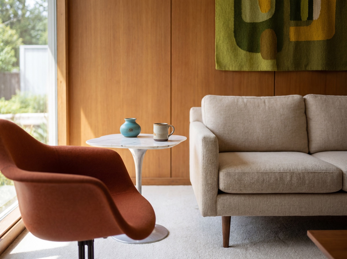
E2 Receipt - The Organic Form Layer
The Bold Accent Color · $239.97
The bold accent color is the element where most MCM rooms either succeed or fall into the starter pack. The teal-only trap is well-documented by the community: pure teal plus walnut plus warm white produces the most recognizable generic MCM template available. The escape: teal plus walnut plus mustard plus warm white produces MCM done with a personal color story. The principle is one bold accent color used at significant scale - an accent armchair in the period-authentic color, rather than scattered across six small accessories - plus a secondary echo color that reinforces it at textile scale. Mustard and burnt orange are the two MCM accent colors with the least starter-pack contamination: the period used them heavily in upholstered pieces, and they read as warm and personal against walnut in a way that teal does not. The MCM geometric area rug introduces the accent color at floor scale, which is the most impactful single piece for shifting the room's color story. The throw pillow set echoes the accent at sofa scale without adding a new furniture piece.
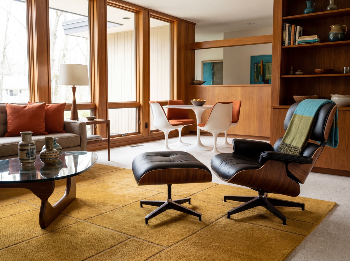
E3 Receipt - The Bold Accent Color
The Statement Lighting · $319.97
Statement lighting is one of the fastest MCM room transformations available - a Sputnik chandelier over a dining table changes the read of an entire space instantly, and an arc floor lamp at a reading chair introduces the room's second light source at exactly the right height for lived-in warmth. The three-fixture approach in the receipt is the anti-Airbnb lighting strategy: the Sputnik for the ceiling (its atomic-age starburst silhouette is a legitimate period piece - the problem is using it as the only MCM design decision), the Arco-style arc floor lamp for the reading or seating zone (a floor lamp with this much arm reach and this specific marble-base geometry is an MCM reference point that reads as personal rather than generic), and warm 2700K LED Edison filament bulbs throughout the entire room. The light quality is as important as the fixture: cool-white or daylight-spectrum bulbs fight the warm walnut story and produce the cold catalogue-staging quality that makes MCM rooms look photographed rather than lived in. The 2700K warm-spectrum choice is non-negotiable for making an MCM room feel like a home.
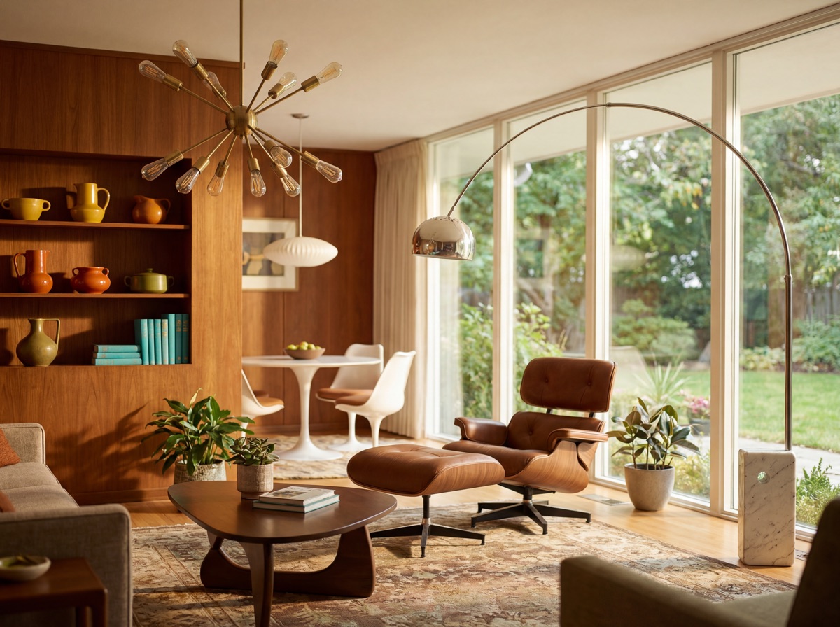
E4 Receipt - The Statement Lighting
The Personal Object Layer · $219.97
The personal object layer is the element that most directly addresses the Airbnb trap. Plants are the fastest way to make an MCM room feel lived-in rather than catalogue-staged. A large monstera or bird of paradise at height - positioned near the credenza or beside the arc floor lamp - introduces the room's strongest organic form and creates a vertical presence that the horizontal MCM furniture vocabulary does not provide on its own. The MCM abstract geometric art print is the wall decision: mid-century modern graphic artwork uses the same geometric vocabulary as the furniture period, with bold flat shapes in the accent color palette against cream or warm white. A framed 24x30 geometric print over the credenza anchors the wall story without the gallery-wall density of maximalism - MCM walls are considered, not crowded. The vintage-look brass globe is the personal object that most immediately signals the MCM period's relationship to the space age and intellectual curiosity of the late 1950s and 1960s, and it is the one object in the room that reads as genuinely personal rather than generic when placed on the credenza among books and a small plant.
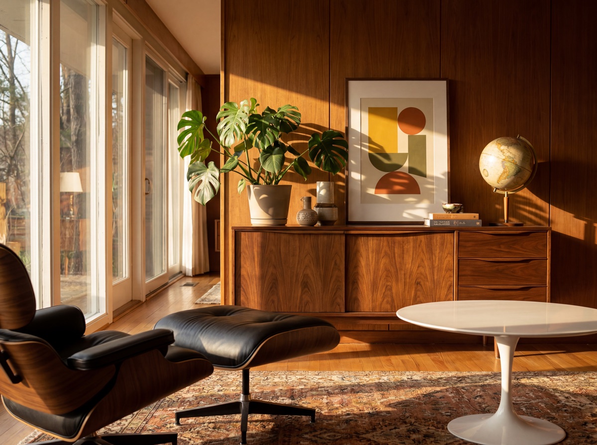
E5 Receipt - The Personal Object Layer
Mid-Century Modern vs. Contemporary.
MCM is a historical style period with period-specific design references. Contemporary design is a present-tense descriptor that changes over time. The 2020s version of contemporary design is warmer and more organic than the 2010s version -- which means MCM and contemporary are visually closer than they have been in decades. Understanding the distinction helps with purchasing decisions: MCM rooms commit to a historical design language. Contemporary rooms borrow from multiple periods without committing.
| Dimension | Mid-Century Modern | Contemporary (2020s) |
|---|---|---|
| Period reference | Specific: 1945-1969, with named designers and documented design principles | Present-tense: current, evolving, not tied to a historical moment |
| Wood tone | Warm walnut and teak -- the grain and warmth are specific to the period vocabulary | Lighter oak, white oak, and light ash -- warmer than 2010s grey but lighter than MCM |
| Leg style | Tapered, splayed, or angled -- the lifted-off-floor visual lightness is a design priority | Varied -- curved platforms, slab bases, or hairpin; leg form is not a defining priority |
| Accent color | ONE bold period color used decisively: mustard, burnt orange, avocado, deep teal | Warm earthy tones -- terracotta, sage green, warm burgundy -- softer and more muted |
| Lighting | Sputnik chandelier, arc floor lamp, sculptural graphic fixtures -- period-specific forms | Organic shapes, japandi-adjacent woven pendants, sculptural ceramics -- warm and soft |
| Failure mode | The Airbnb starter pack -- template execution without personal interpretation | Trendiness without character -- contemporary rooms age quickly when trends shift |
The $699 entry path.
A genuine MCM foundation for under $700. Establishes warm wood vocabulary, organic-form seating, and one bold accent color without the Sputnik-teal-credenza template.
Frequently asked questions.
What is mid-century modern interior design?
Mid-century modern interior design refers to the design period roughly spanning 1945 to 1969 -- the postwar years when American and European designers were solving the question of what functional furniture could look like if it were also beautiful. Key designers: Charles and Ray Eames (molded plywood and fiberglass shell chairs), Eero Saarinen (Tulip table and Womb chair), Harry Bertoia (Diamond chair), and Hans Wegner (Wishbone chair). The defining characteristics: warm wood tones (walnut, teak, oak) with tapered or angled legs, organic forms that reject strict right angles, low-profile horizontal emphasis (credenzas, platform beds, low sofas), one bold accent color used decisively, and graphic artwork combined with sculptural lighting. The style's contemporary relevance is both a strength and a problem -- MCM is so identifiable that it is easy to buy the generic version without building anything personal.
What makes mid-century modern look generic vs. personal?
The community has named the generic version: walnut credenza + teal accent couch + Eames lounge knockoff + Sputnik chandelier + one snake plant. The escape routes: vary the accent color beyond teal alone, add one piece that breaks the formula (a different period silhouette, a contemporary organic piece in walnut), add personal objects that are specific to you (a globe, a record collection, a specific plant), introduce lighting at multiple heights rather than only ceiling, and mix MCM with adjacent styles rather than executing it as a pure catalogue. Plants are the fastest way to make an MCM room feel lived-in rather than staged.
Should I buy authentic or replica mid-century modern furniture?
Three tiers: authentic (Herman Miller, Knoll, Fritz Hansen -- $2,000-7,000 per piece), quality replica (Article, Castlery, Kardiel -- $200-800), and budget (IKEA STOCKHOLM, LISABO, Amazon Rivet brand -- $50-200). The honest answer: start with quality replicas or budget pieces and invest in one authentic item over time if the style proves durable in your home. The most defensible authentic MCM purchase is the one used daily and touched repeatedly -- a chair where the material quality is felt every day. The credenza and coffee table are pieces where quality replicas are genuinely hard to distinguish in a room. The Eames Lounge Chair is the piece most often cited as worth the authentic premium -- the distressed leather and plywood shell of the original ages in a way replicas do not.
What colors are used in mid-century modern interior design?
MCM uses warm wood tones as the structural color (walnut, teak, and oak), warm white or off-white walls (not stark white), and ONE bold accent color used decisively: mustard yellow, burnt orange, avocado green, or deep teal. The accent color should appear in one significant piece (the accent chair, the sofa, the large area rug) and echo in smaller textiles and objects. The starter pack error is teal-only: pure teal plus walnut plus white equals the generic template. The escape: teal plus walnut plus mustard accents equals MCM done personally. Avoid stark white walls (too cold for the warm wood story) and avoid multiple bold accent colors at the same weight.
What lighting is best for mid-century modern rooms?
Three authentic MCM lighting categories: the Sputnik chandelier (a legitimate period piece -- the problem is using it as the only MCM design decision), the Arco-style arc floor lamp (marble base with long brass arm adds drama and a second light source at a living height), and the statement pendant over a dining or work surface. The MCM lighting rule: one statement fixture per room, warm 2700K bulbs throughout, and at least one lamp at table height to avoid the overhead-only lighting that makes MCM rooms feel cold and catalogue-staged. The 2700K warm-spectrum bulb choice is non-negotiable -- cool-white bulbs fight the warm walnut story.
How is mid-century modern different from contemporary design?
MCM is a historical style period (1945-1969) executed with period-specific references. Contemporary design is a present-tense descriptor that refers to whatever is current. The 2020s contemporary design is warmer and more organic than the 2010s version -- which means MCM and contemporary are visually closer than they have been in decades. The practical distinction: MCM rooms commit to the historical design language (tapered legs, walnut warmth, atomic-age lighting, one bold period accent color). Contemporary rooms borrow from multiple periods without committing to any. The blend of both -- MCM bones with contemporary organic softness -- is one of the most successful current approaches.