Table of Contents
A home that looks inherited.
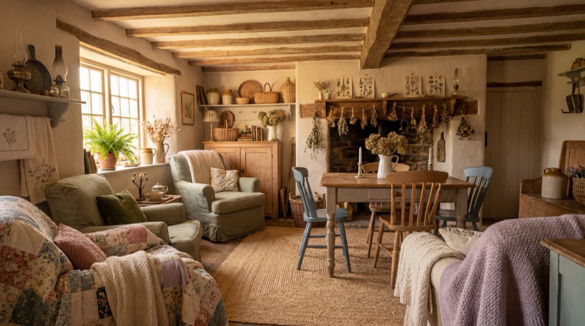
French country interior design is not a style in the way that Japandi or mid-century modern are styles - it is a design philosophy rooted in the rural farmhouses and village homes of Provence. The fundamental principle is one that Architectural Digest documents as the style's defining characteristic: every piece should look as though it has provenance. A copper pot is not decoration. It is evidence that someone cooked in that kitchen for fifty years. A linen tablecloth is not a styling prop. It has been washed so many times it has softened into the color of old paper. The Patina Story is this principle made into a practice: rooms that look accumulated over time rather than assembled in an afternoon.
The distinction between French country (Provencal, rural, farmhouse-adjacent) and French Provincial is one that The Spruce documents carefully. French Provincial draws from the more formal regional manor houses of pre-revolutionary France - carved and painted wood furniture, silk upholstery, symmetrical room arrangements. French country is humbler: linen instead of silk, terracotta instead of gilded wood, wrought iron instead of carved ornament. French provincial rooms feel arranged; French country rooms feel accumulated. For most contemporary interiors and most budgets, French country is the more forgiving and accessible reference - it tolerates imperfection and mixing in ways that French provincial does not.
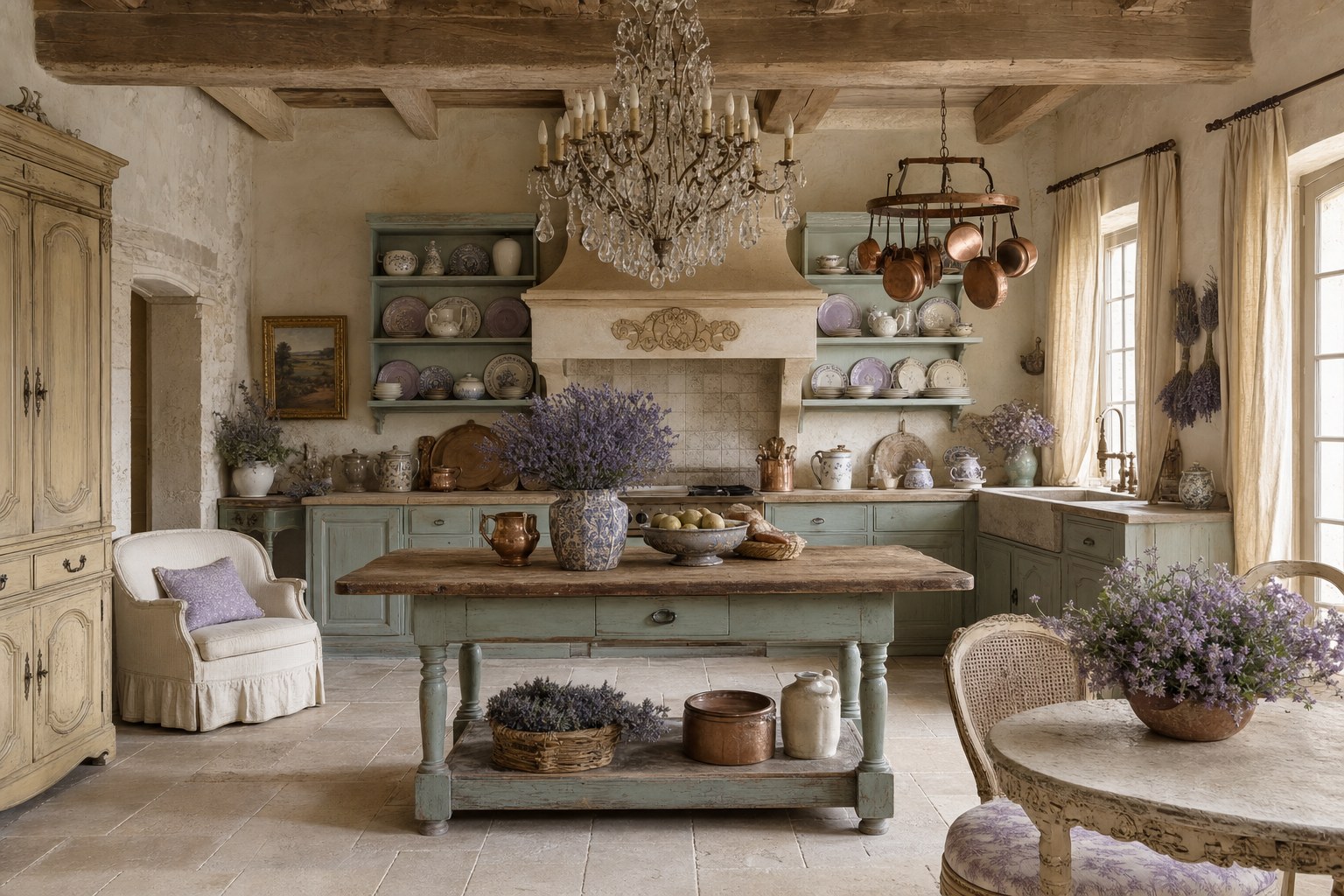
The style's most complete expression is the kitchen. Open shelving displaying mismatched ceramic plates and pitchers, copper cookware hanging from a ceiling rack, a farmhouse sink with a bridge faucet, dried herbs and lavender bundles hanging from exposed beams or window hardware - these are the signals that read as genuinely French country rather than an approximation. The five elements below are structured around the kitchen as foundation and the botanical and material finish as the layers that make a room feel lived-in rather than staged. The anti-kitsch checklist applies throughout: no roosters as decorative motifs, no sunflower overload, no Amazon French Country sets, no matching furniture sets.
The Kitchen Foundation · $399.96
The kitchen is where French country begins and where it is most completely expressed. House Beautiful documents this consistently: the style's most aspirational images are kitchens - open shelving, copper cookware, farmhouse sinks, and the particular quality of light that comes through unlined linen curtains onto mismatched ceramics and worn stone surfaces. The kitchen foundation element addresses the structural decisions that make a kitchen read as French country: open shelving that displays instead of concealing, a farmhouse sink that reads as utilitarian and permanent rather than decorative, a copper pot rack that is a functional object with strong visual presence, and ceramic canisters that are mismatched in the way that accumulated objects over time are always slightly mismatched. The copper hanging pot rack is the single highest-signal piece in this element - it communicates immediately that the kitchen is used for real cooking rather than for staging, which is the core message of the Patina Story. The ceramic storage canisters should not match each other exactly; the minor variations in glaze and form are the visual evidence of things being acquired from different sources at different times.
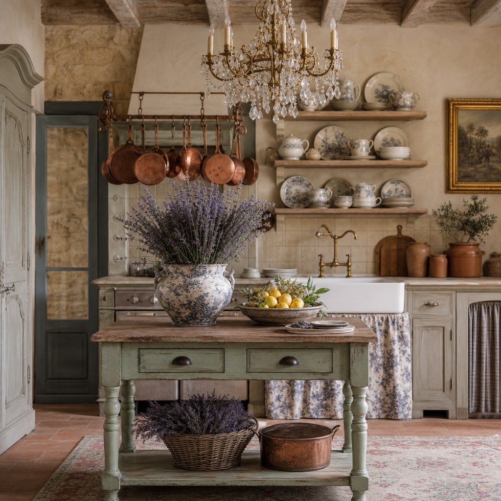
E1 Receipt - The Kitchen Foundation
The Linen Layer · $269.97
Linen is the fabric of the Provence market. The Spruce is unambiguous about its role in French country design: linen upholstery, linen slipcovers, linen curtains - and crucially, unlined so that light filters through rather than being blocked. The critical quality of linen in this context is precisely the quality that makes people hesitate to use it: it wrinkles. The slight crumple of a laundered linen slipcover, the soft drape of an unlined linen panel letting afternoon light through its natural fiber weave - these are the material signals that communicate lived-in rather than staged. A polyester "linen-look" fabric fails the French country test immediately because it holds its shape too well; it has the color of linen but not the history. The three-piece receipt covers the three largest textile surfaces in a room: upholstery (the slipcover sofa), windows (96-inch unlined panels in natural flax), and the dining or kitchen table (a washed linen tablecloth that has been softened by repeated washing into the warm off-white that new linen never quite achieves). The slipcover form is important: a slipcovered sofa reads as French country in a way that tight upholstery does not, because slipcovers have the softness and slight imprecision of something washable and re-fittable - something used rather than displayed.
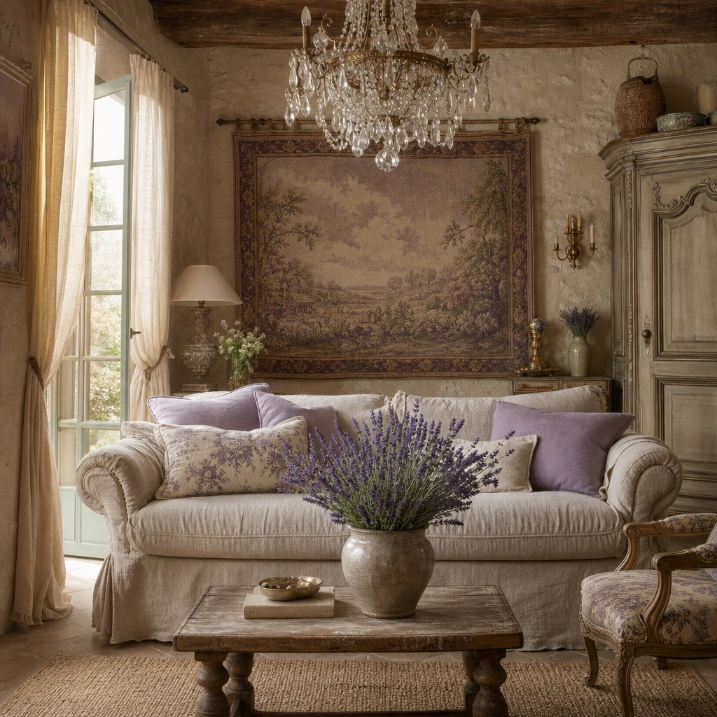
E2 Receipt - The Linen Layer
Vintage Ceramics and Objects · $199.96
The ceramics layer is where the Patina Story becomes most legible at the object level. Country Living Magazine documents the role of mismatched ceramics in French country design with a specific principle: the mismatching is not accidental, it is the visual evidence of accumulation over time. A collection of ceramic pitchers that all came from the same Amazon listing communicates immediately that they were purchased together. A collection with three different glazes, two different heights, and one crack that has been repaired reads as gathered over years from different markets and sources. The practical sourcing implication for this element: when possible, source the ceramics from different places - one from an estate sale, one from a thrift store, one from a retail purchase. The visual variety this produces is impossible to replicate when buying a coordinated "set." The hand-painted dinner plates serve the open-shelving display function identified in the kitchen foundation element: shown on open shelves rather than stored behind cabinet doors, they contribute to the visual interest of the kitchen and to the anti-Amazon, pro-provenance narrative. The terracotta serving bowl introduces the earthenware material that is the ceramic signature of the Provencal kitchen - coarser than porcelain, warmer than stoneware, and more immediately connected to the agricultural origin of the style.
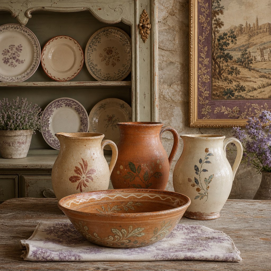
E3 Receipt - Vintage Ceramics and Objects
Iron and Copper · $309.97
Wrought iron and copper are the two metals of the French countryside. Veranda documents their role in French country interiors as functional objects that double as visual anchors: the iron chandelier that has hung in a kitchen for fifty years, the copper wall piece that came from a Provencal market rather than a chain retailer. The key quality in both materials is the same as in the ceramics element: they should show their material nature honestly. A wrought iron chandelier that looks hammered and slightly irregular reads as genuine. A chandelier that looks uniformly stamped from a mold reads as mass-produced regardless of the iron content. Copper should be hammered, not lacquered to a uniform mirror finish - the slight variation in hammer texture catches light differently across its surface in a way that communicates craft origin. The iron curtain rod connects the linen panel element to the iron element: the material of the rod and finials is part of the room's composition, not just functional hardware. Cast iron cabinet pulls and knobs are the highest-impact-per-dollar intervention in this element - replacing standard builder-grade hardware throughout a kitchen with cast iron pulls shifts the material register of the entire room for under $35, and the change is fully reversible for renters.
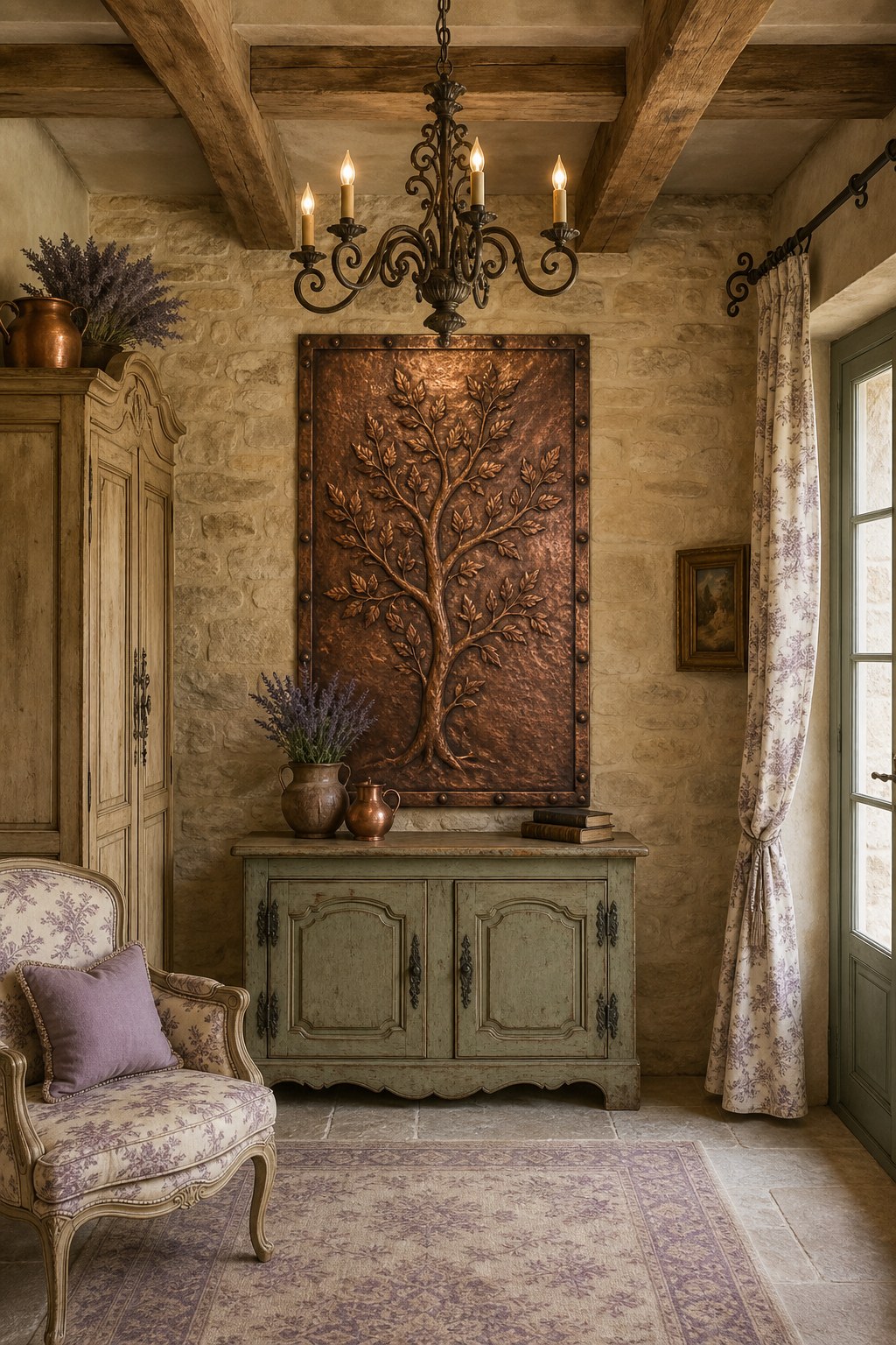
E4 Receipt - Iron and Copper
The Botanical Finish · $218.95
The botanical finish is the layer that separates a room with French country elements from a room with the French country spirit. Better Homes and Gardens documents this distinction with a specific principle: the botanical elements in a French country room should smell like Provence, not just look like it. Dried lavender bundles hung from a doorframe or placed in an open ceramic bowl introduce the olfactory dimension that the other four elements do not address. The scent of lavender - which is both the agricultural signature of the Provence region and the most immediate sensory reference to the style's landscape origin - triggers a recognition response that no visual element alone produces. Toile de Jouy - the traditional French printed textile in cream and blue, cream and burgundy, or cream and black - is the one patterned element with the strongest French country signal. The pillow cover form is the lowest-commitment and most reversible way to introduce it into a room. The botanical print toile curtain panels serve the dual function of pattern introduction and window treatment: swapping a plain linen panel for a toile panel in a bedroom or dining room shifts the room's character significantly. The dried herb wreath provides a botanical element with year-round presence and a scent that builds slowly over months - a plant element that requires zero maintenance and gains authenticity as it ages.
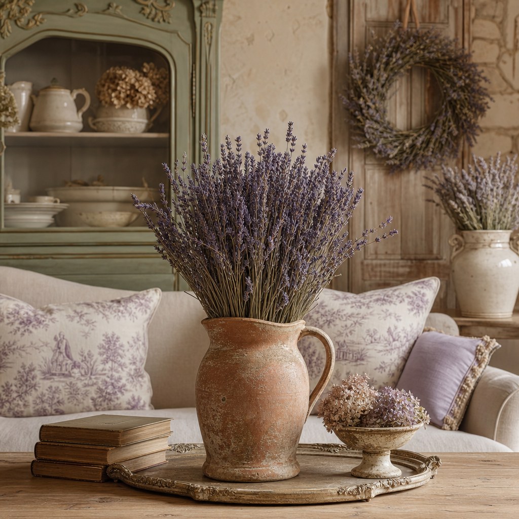
E5 Receipt - The Botanical Finish
French Country vs. American Farmhouse.
Both styles are rooted in rural, agricultural origins and share a commitment to natural materials, functional objects, and unpretentious rooms. The distinction is geographic and cultural: American farmhouse is plains-country and Shaker-adjacent, with shiplap walls, galvanized metal, and a more restrained material palette. French country is Provencal-origin, sun-soaked, and expressly sensory. Lavender, copper, toile, and the particular warmth of a room that smells as good as it looks.
| Dimension | French Country | American Farmhouse |
|---|---|---|
| Geographic origin | Rural Provence, Normandy, Loire Valley. The French working farmhouse and village | American Great Plains and rural South. The working farm, barn, and Shaker-influenced utility tradition |
| Primary metals | Wrought iron and copper. Hammered, aged, and patinated rather than polished | Galvanized steel, matte black iron, brushed nickel, cleaner finishes, less patina emphasis |
| Textile language | Linen and toile de Jouy. The aged, washed quality is the point | Buffalo check, grain sack stripe, cotton canvas, pattern-forward rather than material-forward |
| Botanical element | Lavender, dried herbs, Provencal wildflowers, the landscape of the Midi | Cotton stems, magnolia, galvanized buckets with greenery, American botanical palette |
| Ceramic type | Terracotta, hand-painted regional ceramics, Provencal earthenware | White stoneware, mason jars, crock-style vessels with simple or no decoration |
| Color palette | Aged cream, warm terracotta, dusty lavender, olive, warm ochre, sun-faded and time-softened | Warm white, navy or deep green accent, natural wood, cleaner contrast, less aged quality |
The $259 entry path.
A room-scale French country shift for under $260. Fully reversible, renter-friendly, and sufficient to change the material register of any room immediately.
Frequently asked questions.
What is French country interior design?
French country interior design is a residential style rooted in the rural farmhouses and village homes of Provence and the broader French countryside. It is defined by its relationship to provenance and accumulated history: every piece should look as though it has been used and loved rather than purchased for decorative effect. The style's material vocabulary is linen (slipcovers, curtains, tablecloths), terracotta (pottery, tile, vessel), wrought iron (chandelier, hardware, curtain rods), copper (cookware, pot racks, decorative objects), and botanical elements drawn from the Provencal landscape (dried lavender, thyme, rosemary, toile motifs). The palette is always muted and time-softened: aged cream, warm terracotta, dusty lavender, olive, warm ochre. The style's most commonly cited failure mode is the Amazon French country set - matching roosters and sunflower motifs that produce a costume rather than a genuine patina.
What is the difference between French country and French provincial design?
French country originates in the rural working farmhouses of Provence - humble, functional, and built from linen, terracotta, iron, and copper. French provincial draws from the more formal regional manor houses of pre-revolutionary France - carved and painted wood furniture, silk or damask upholstery, and a more restrained, symmetrical room arrangement. French provincial rooms feel arranged; French country rooms feel accumulated. For most contemporary interiors, French country is the more accessible and more forgiving reference: it tolerates imperfection, mixed sourcing, and budget constraints in ways that French provincial does not. If working with a limited budget, French country is almost always the right reference; French provincial requires either significant investment in period furniture or the visual knowledge to edit it convincingly.
What colors are used in French country interior design?
French country uses a palette built on temporal degradation: every color should look as though it has been in the sun for thirty years. The base palette is warm and muted - aged cream, warm off-white, stone grey, and weathered natural linen for walls, floors, and primary upholstery. The accent palette draws from the Provencal landscape: warm terracotta and clay (regional pottery and roof tiles), dusty lavender (Provence field crops), soft sage and dusty olive (herb garden foliage), warm ochre and mustard yellow (Provencal textiles). What the palette excludes: anything saturated, anything bright, anything that reads as freshly painted. The toile de Jouy color combination - cream ground with blue, burgundy, or black motifs - is the one traditional patterned element with the strongest French country identification.
How do I source authentic-looking French country decor on a budget?
The primary sourcing strategy is estate sales first, then Facebook Marketplace, then targeted retail for specific gaps. Estate sales are the primary source because pieces arrive with actual provenance: copper cookware that has been used, ceramic pitchers that have been handled, linen tablecloths that have been washed into softness. The patina story is very difficult to convincingly fake with new purchases; estate sale pieces carry it for free. For oversized pieces - armoires, farm tables, large copper sets - Facebook Marketplace offers the best price-to-patina ratio. For retail, Pottery Barn is the most consistently French country-adjacent accessible brand. What to avoid: any product sold as a "French country set" on Amazon (roosters and sunflower motifs), any matching furniture collection, and any piece with hardware that looks machine-stamped rather than cast or hammered.
What makes French country look cheap vs. authentic?
The four cheapening signals: roosters as decorative motifs, sunflower overload, matching furniture sets, and Amazon French Country bundles. Both roosters and sunflowers are authentic Provencal symbols but they have been so overused in the American mass-market interpretation that they now read as caricature. Matching furniture announces that the room was assembled rather than accumulated. The most effective single correction: replace one new-looking piece with one estate sale find. A $12 ceramic pitcher from an estate sale carries more authentic weight than a $60 "vintage-look" pitcher from a big-box store. Copper must be hammered, not mirror-lacquered. Linen must wrinkle, not hold its shape like polyester.
Can French country interior design work in a modern apartment?
Yes - with the understanding that apartment French country is an edited version of the style rather than a full Provencal farmhouse expression. The three elements that translate most reliably: linen (slipcovers, curtain panels, and a tablecloth require no structural changes), botanical elements (dried lavender bundles, ceramic pitchers with dried florals, and a herb planter on the windowsill introduce the Provencal sensory dimension with no floor space requirements), and copper or iron hardware (replacing cabinet pulls is fully reversible and the highest-impact-per-dollar French country intervention in a standard kitchen). For renters, the $259 entry path in this guide achieves the essential French country atmosphere with no permanent changes. Open shelving - which requires landlord permission - can be worked around with free-standing shelving units. Terracotta tile can be approximated with a terracotta-toned area rug.